project no.2
interaction + information design
3 week academic project creating an expansion of the LUSH website. offering a pre-designed skincare bundles product page, enabling users to easily learn and adopt effective skincare practices. boosting users' self-assurance and knowledge about their specific skincare requirements, fostering a sense of confidence in their own skin.
my role visual designer, ui designer, content strategist
duration of project february 2023 to february 2023
created by vanessa zwierzchowski, darina nikolova, kaleigh tran, yixuan liu, and baseer joya

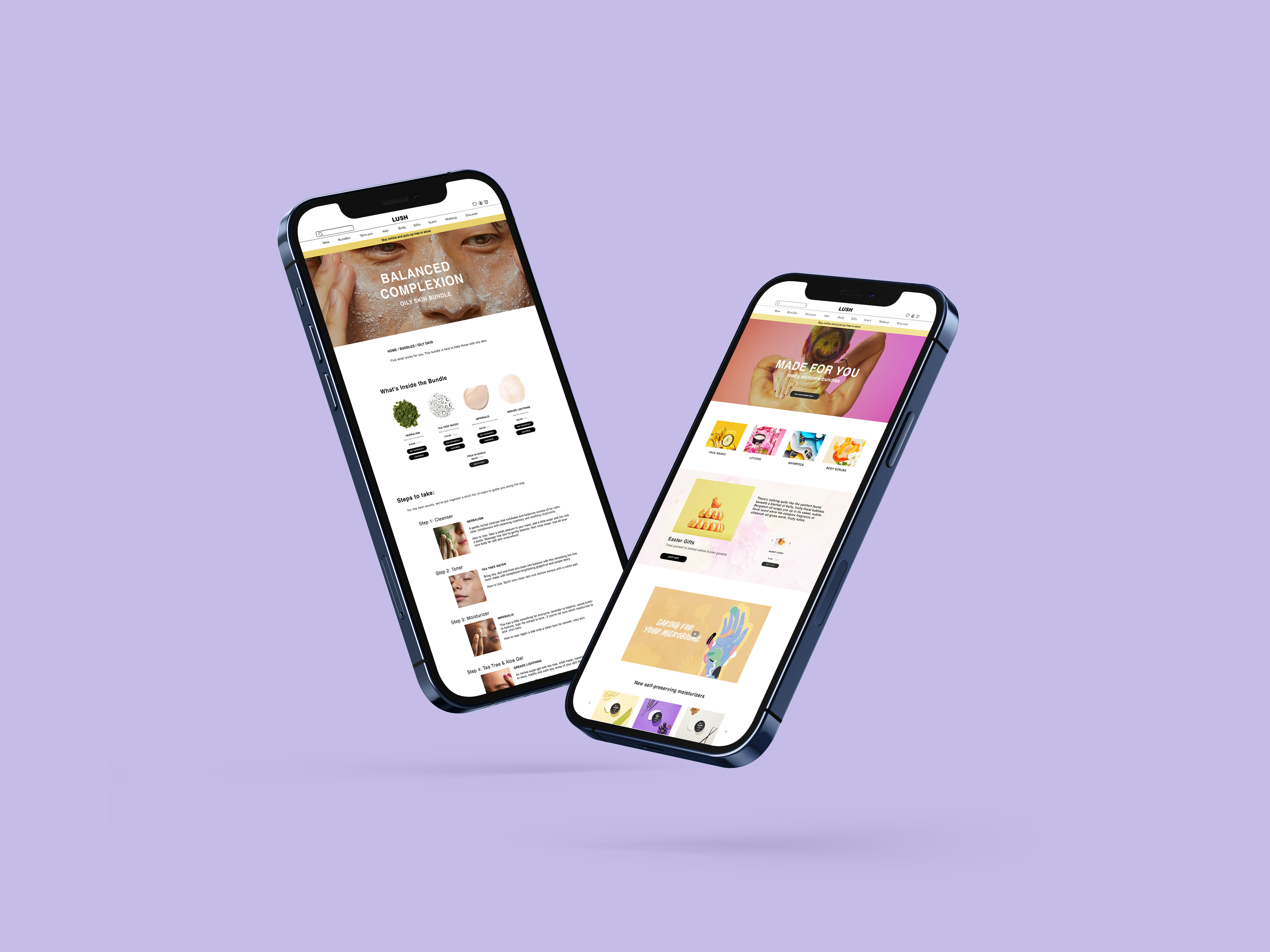
mockup made by me, showcasing the new bundle and re-worked main page
In February of 2023, my team and I were assigned to create a digital screen-based (interaction + infromation design) project for a brand of our choice. It was imporant to choose a brand that we knew would make sense; there had to be a purpose and a solid reason for the problem we had to solve. In the end, with a finalized framing plan and problem statement, my team and I selected LUSH as our company to build our interaction project on. We developed a fully prototyped re-design of the LUSH website in Figma while also expanding its functionality with a brand new skincare bundle page that we created.
with a steadfast commitment to the skincare + self-care industry, LUSH strives to elevate their mission. they take immense pride in their dedication to customer care, therefore our goal was to amplify this narrative by extending the functionality of their website.
LUSH is a brand that not only prides themselves on customer care but also in creating products from fresh and organic ingredients. They avoid from using unsafe synthetics and preservatives in their products. They emphasize their values through their collections of handmade and ethically sourced products. LUSH's marketing approach revolves around transparency and openness, aiming to showcase these exceptional products to their customers.
we conducted research to support our outlook and further develop and finalize our framing + problem statement.

"On average, women use 5 skincare products per day," according to a report by NPD in 2020. Skincare consumers often feel overwhelmed by the choices and the task of pairing these products together. Our solution addresses this challenge by carefully curating product combinations that work seamlessly in a routine, simplifying the process for consumers with all different skin types.
framing + problem statement.
how might we encourage and guide new consumers to invest in a proper skin care regime with LUSH? improving efficiency + highlighting the organic ingredients used in the products.
It was significant to the project that we developed framing that could push us to create a useful additon to LUSH. With LUSH already existing as a successful and effective brand, we took up the challenge to further pursue and develop a new sense of functionality to their website. Therefore, we proposed to introduce a section to the LUSH website that introduces ready-made skincare bundles that will apply to each consumer's needs and all skin types in order to aid them to begin and maintain a proper skincare routine.
the space we have created.
entering the bundle page where curated bundles for oily, combination, dry, and sensitive skin are collected. skincare bundles made for you.
simple navigation provided from the main page, introducing the new skincare bundle page with a new banner and button. layout and content organized by me.
when accessed, the bundle page greets the user with four curated skincare bundles, complete with their own regimen designed for various skin types. layout created by me.
a look inside the curated bundle for oily skin types.
along with the products in the bundle, step-by-step instructions are provided to maintain a stress free experience for users who are new to the skincare world.
a look inside of the oily skin type skincare bundles. providing information on the products and instructions.
With the goal of creating an online space for those who are new to skincare, we made choices to clearly state what kind of products and ingredients are to be expected in each bundle. We strived for full transparency when creating the product page, similarly to LUSH and their mission with skincare.
Another detail that I thought was important to implement within the website was blending our new bundle page with LUSH's marketing + overall style. LUSH is known for the creative and quirky names that they provide to each product. So, with that in mind, the team spent time coming up with unique names for each skincare bundle. For example, we finalized on the name "Best of Both Worlds" for the combination skin type bundle that we curated.
for those with more experience with skincare, who prefer to customize the existing bundles, we offer the option of easily switching out any product they desire, providing similar alternatives to guide the process.
using the 'customize' button, users are effectively able to switch out any products that they would like in the bundle. allowing a customization process provides freedom for users and their bundles. layout of page created by me.
along with being able to customize any product, each product has similar replacement options for the user to explore and select. this also helps introduce other products to the user that they may be unaware of.
main takeaways and insights from the project.
essential steps of research taken to achieve the proper framework to create a well-rounded project.
A large takeaway of mine from this project was the importance of research that we organized to further make sense of what the project meant to the team. Without proper evidence/research for the problem, such as users being overwhelmed by skincare, it is difficult to justify a purpose for a project. Finding reason and a need for the work was vital to the team's development, both improving creativity and contributing to a more impactful design. A solid foundation of evidence was what propelled the group forward to solve the initial framing in a digital screen-based project.