Avalanche Canada, UX/UI Design
Timeline 1.5 weeks (Accelerated design course)
The team 6 students
Role UI Designer and UX Research
Tools Figma, FigJam, Adobe Photoshop, User Interviews
Avalanche Canada is a non-profit committed to improving public safety in Canada’s winter backcountry. While their mobile app provides avalanche forecasts and user-submitted observations, many essential safety resources (like checklists and how-to guides) are only accessible through their website. This creates challenges for users, especially newer skiers and snowboarders who may lack internet access or familiarity with avalanche safety practices. Our redesign brings these critical resources into the app itself, making them easier to access, understand, and use without reception. The scope of the project centered on two newly added tools: the Quick Info categories and the Slope Elevation tool.
Limitations of the Current App
The current Avalanche Canada mobile app only gives users access to basic forecast reports and user-submitted observations. Most of their learning resources, like safety checklists and how-to guides, are only available on their website. These limitations become especially problematic in the backcountry, where cell service is unreliable. While users are expected to prepare before heading out, having access to key resources on the go (like refresher guides) can support safer decision-making when conditions shift or uncertainties arise.
User Research Insights
We found that interest overall increased during the pandemic in backcountry skiing and snowboarding has surged—over 4,400 people accessed the backcountry from Whistler Blackcomb in 2023 alone, a 17% increase from the previous season (CBC News, 2023). This increase includes many first-time or less-experienced users, who are often unaware of how rapidly conditions can change in the mountains.
My Role in Research
As part of the research process, I conducted interviews with intermediate to expert backcountry skiers to understand how they use technology to prepare for trips. A recurring issue was how time-consuming it was to revisit avalanche safety knowledge each season. Many backcountry goers wanted a faster way to refresh key concepts without looking through the more complex documents or charts. One skier shared, “I like to review my knowledge and terminology before the start of a season, but I wish there was a more straightforward refresher video page instead of having to click through the entire dictionary for terms” – Backcountry Skier, 2 years experience. This highlighted a clear need, for a simplified, easily accessible resource that could support seasonal preparation and decision making. This insight directly informed the creation of the Quick Info feature in our redesign.
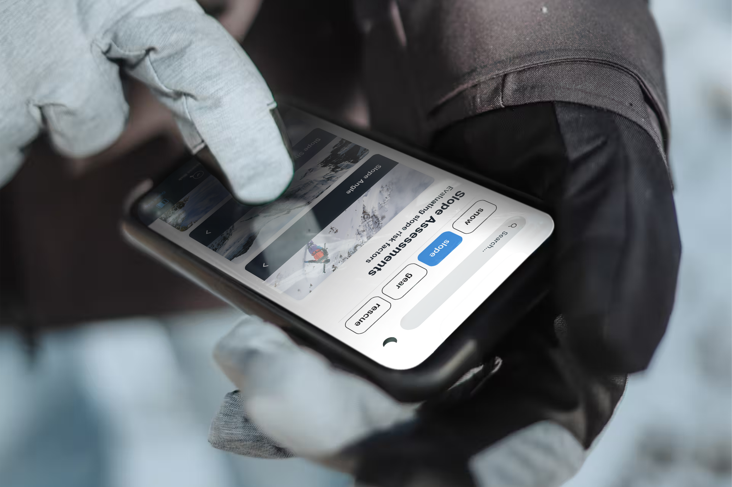
I also focused on how visual design could support users in harsh conditions. Having used my phone in harsh skiing conditions, I participated in the development of a high-contrast colour palette and tested it across different environments (in sunny weather, wearing goggles, in the dark, etc.). In snowy or low-light environments, contrast becomes a safety factor, therefore this was a crucial part of some of the design decisions I took in the app.
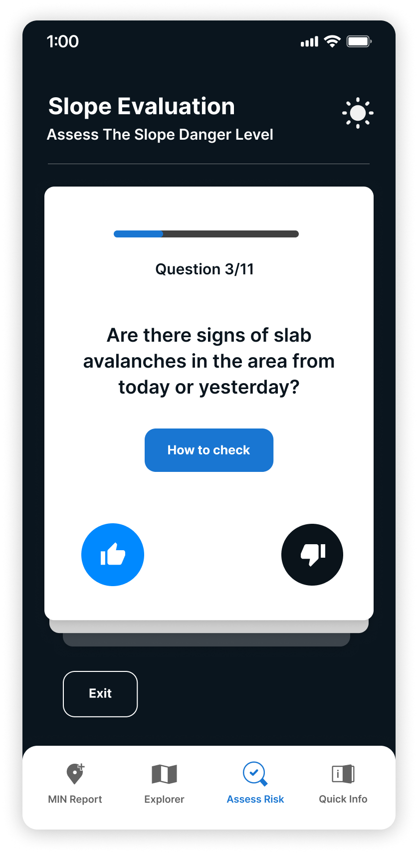
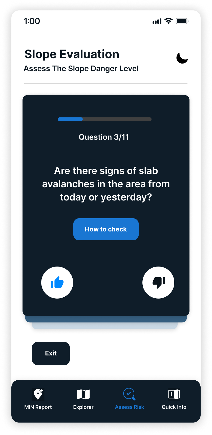
Colour Exploration with Night Mode
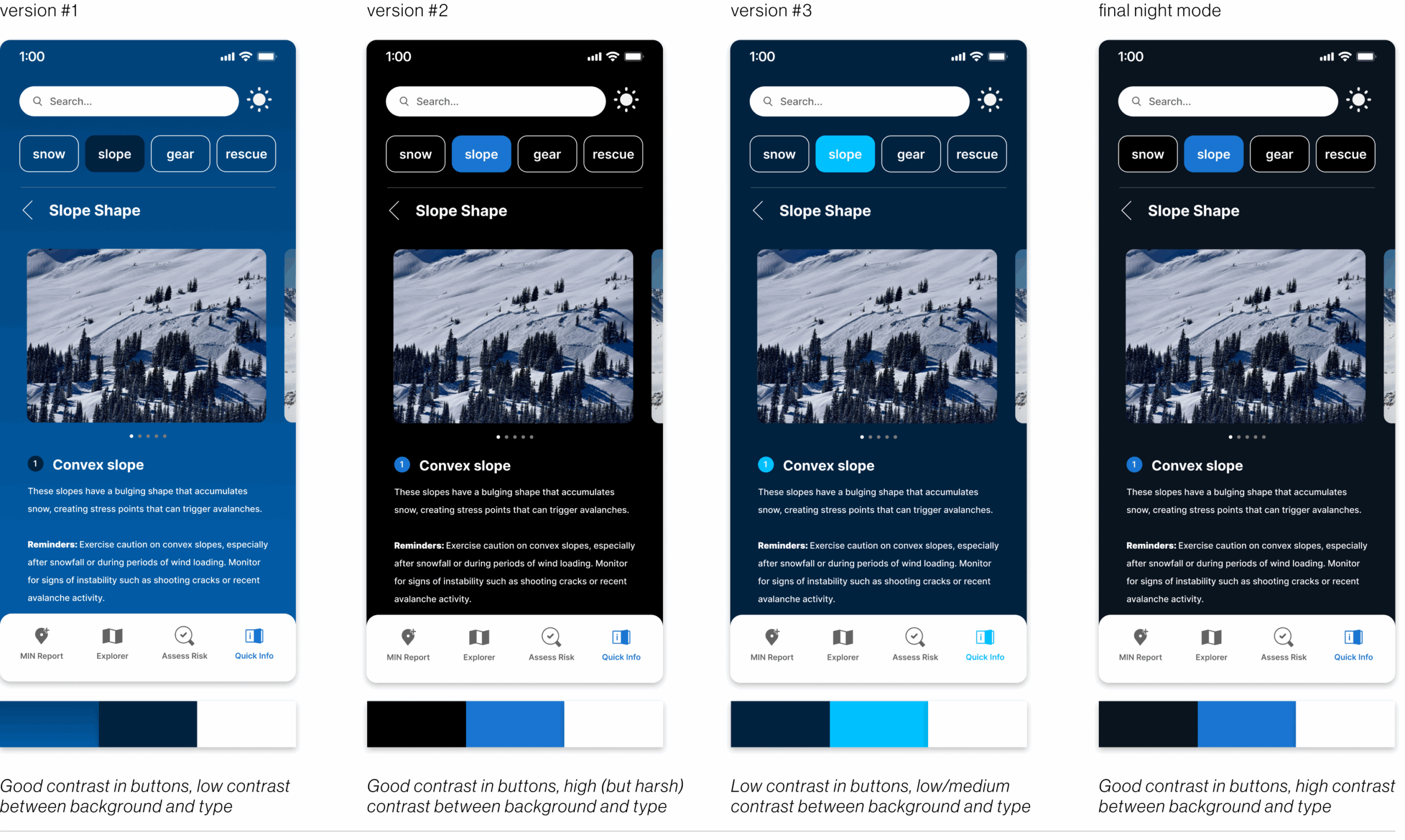
This colour exploration above aimed to balance contrast, legibility, and comfort in night mode. The first version lacked contrast with the background, making text hard to read. The second improved visibility but felt too harsh. The third also lacked constrast, more specifically with buttons. And lastly, the final navy background offered clear contrast without the strain, making it the most readable and comfortable option.
My Role in the UI Intervention
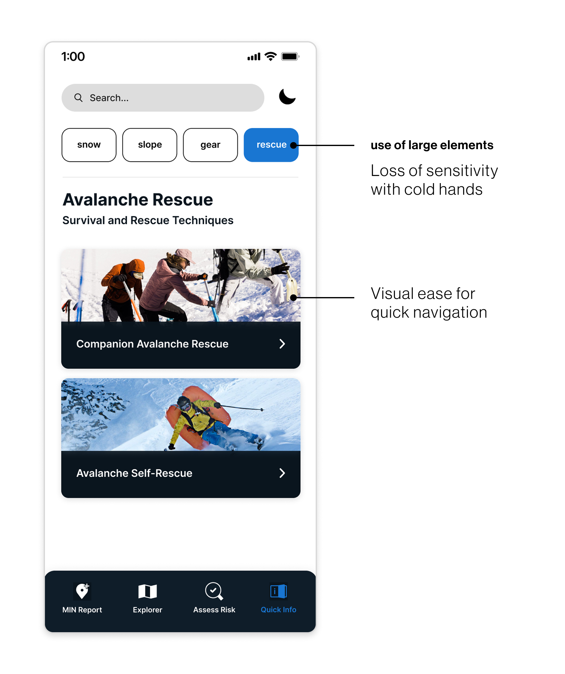
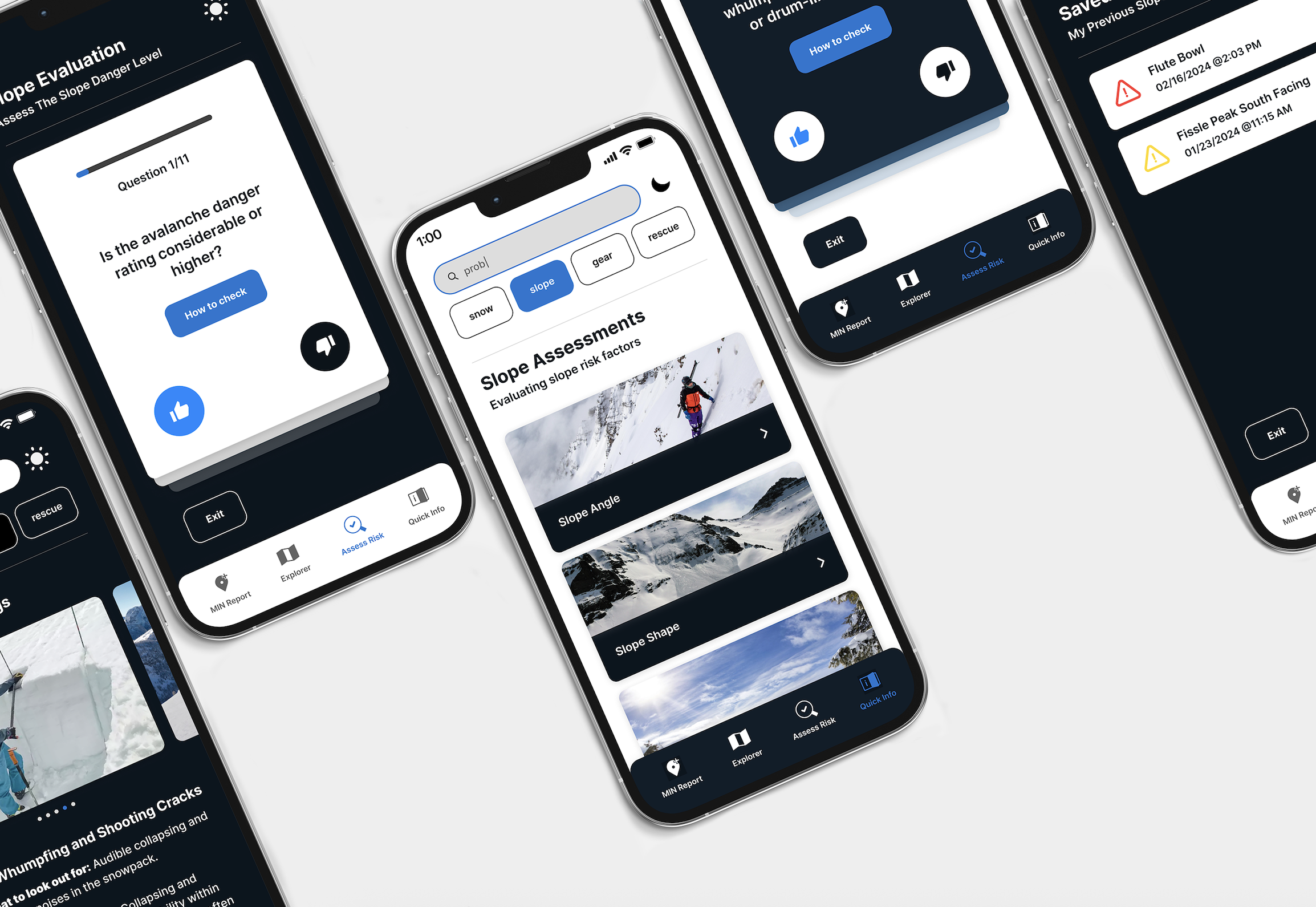
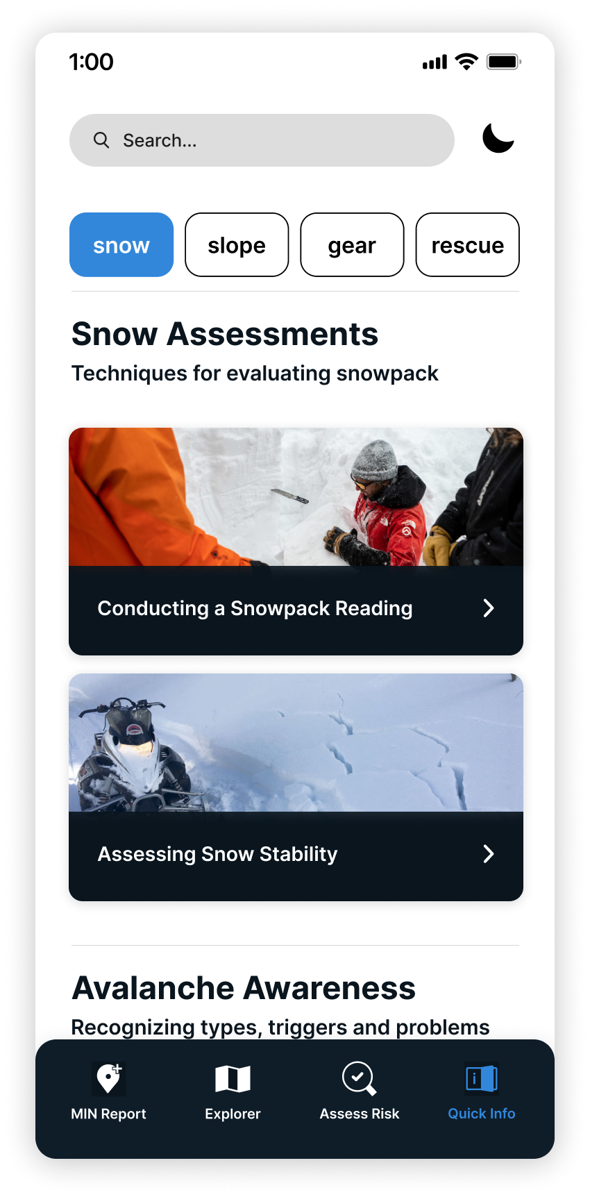
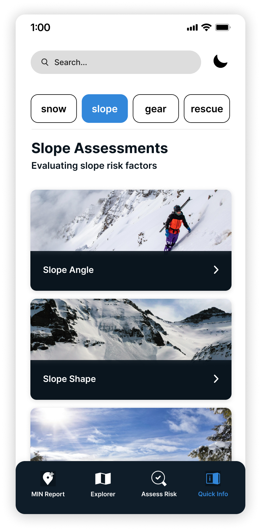
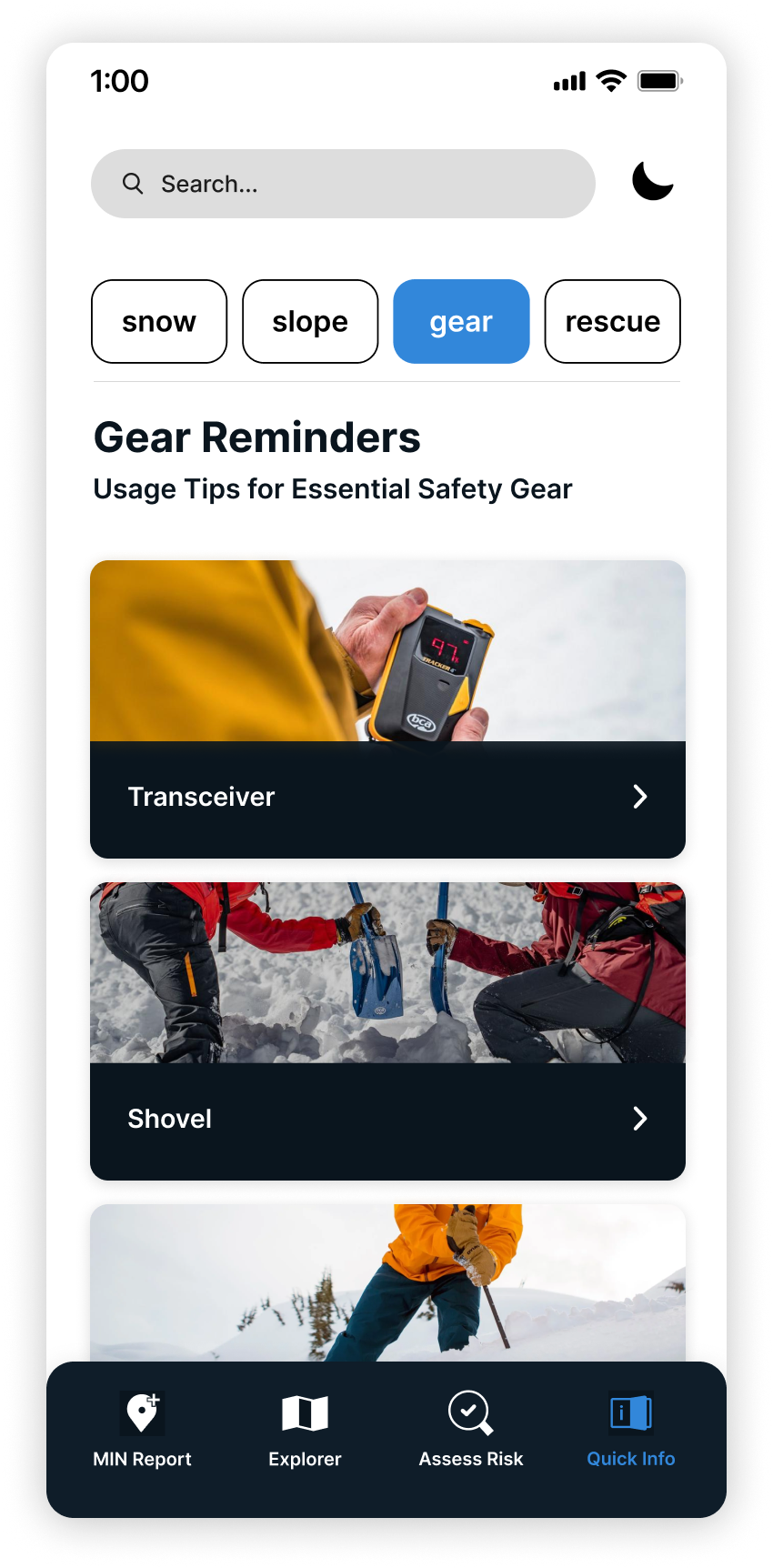
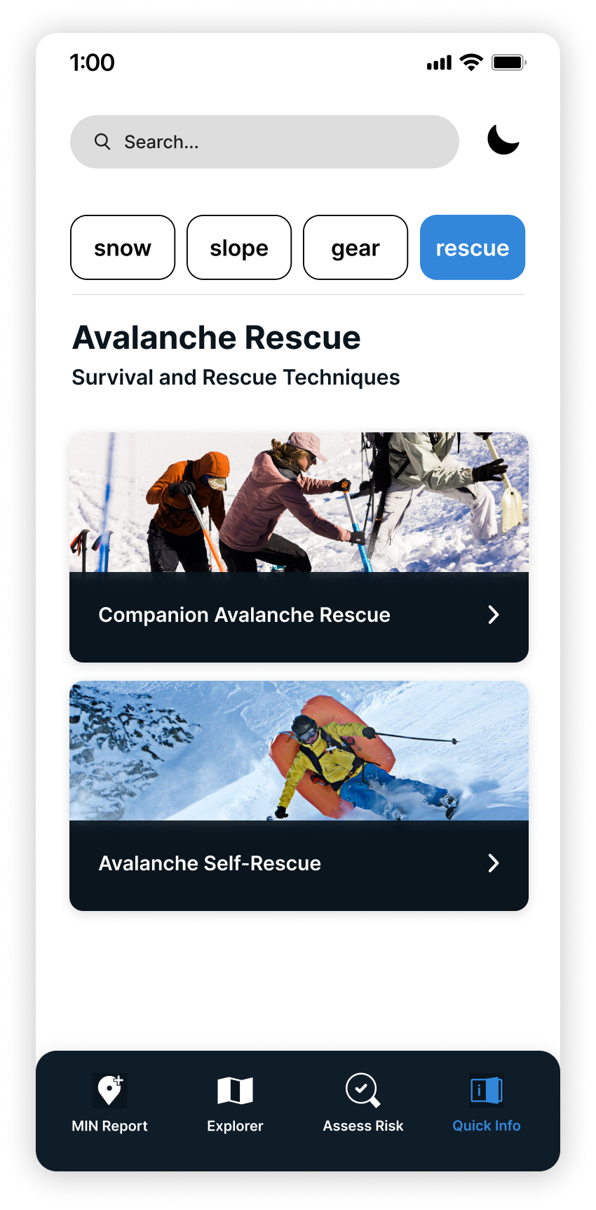
After our team mapped out two new features (Quick Info and Assess Risk) I focused on designing the layout and structure of key screens for Quick Info. My goal was to organize essential avalanche resources into clear, easy-to-navigate sections that users could access quickly, therefore we landed on 4 categories: snow, slope, gear, and rescue.
As one of the UI designers, I created high-fidelity mockups that emphasized readability, clarity, and consistency across both light and night modes. To ensure the app was usable in real backcountry conditions, I followed the WCAG 2 accessibility principles—Perceivable, Operable, Understandable, and Robust, throughout the design process. I also used tools like Contrast Checker and WebAIM to confirm that the text and interface elements were legible and functional across various devices and for users with different accessibility needs.
To support usability in cold environments, I designed with larger interactive elements that are easier to tap if users experience reduced hand sensitivity in low temperatures. These larger targets also help skiers who wear touchscreen-compatible gloves or liners under their main gloves. Visually, the larger elements improve navigation speed, helping users quickly locate the information they need when time or visibility is limited.
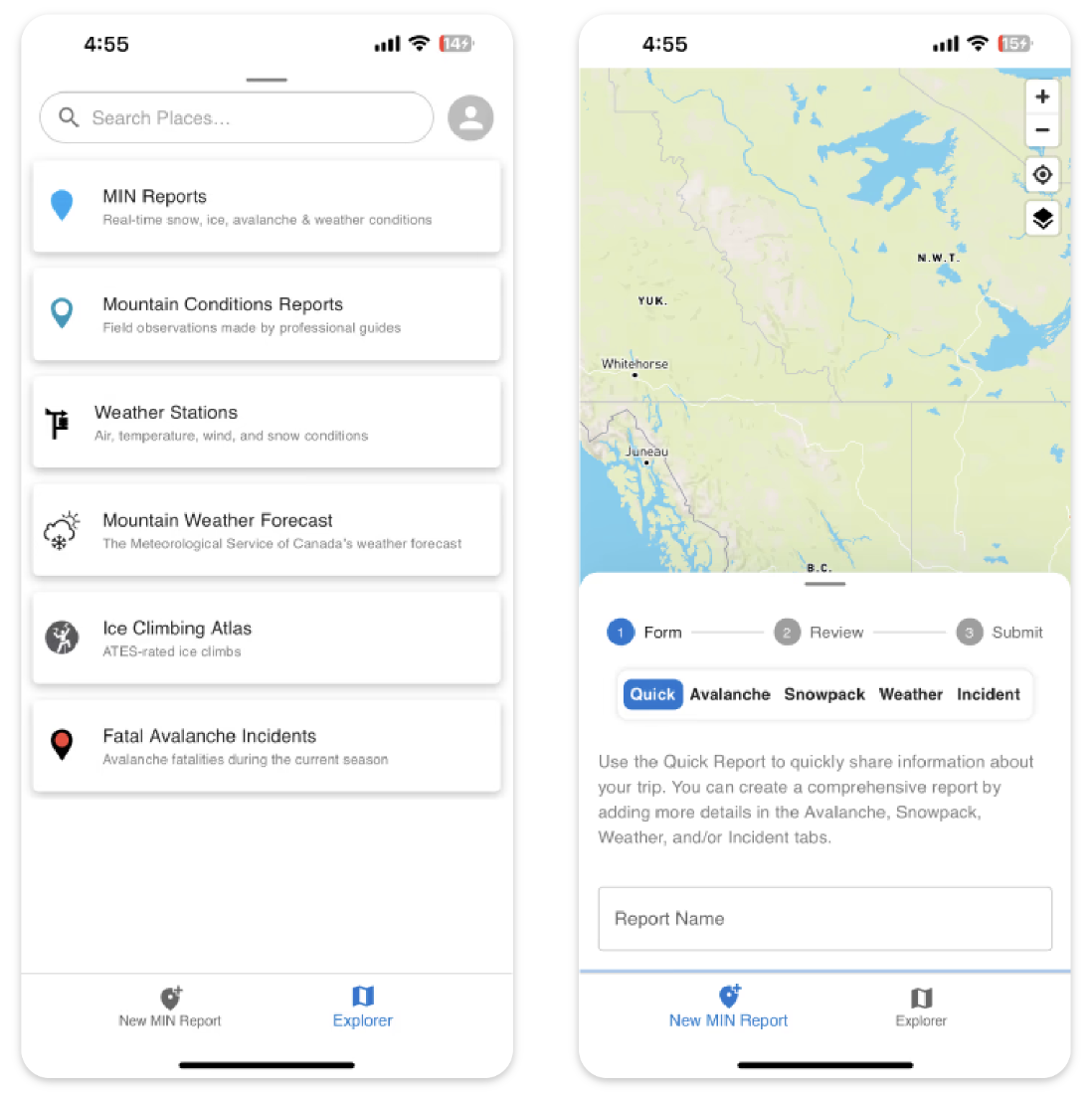
The Overview
Assess Risk Categories
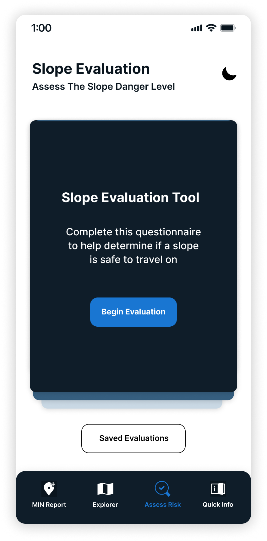
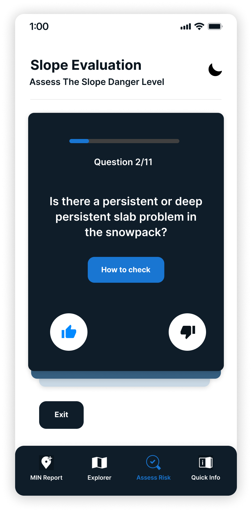
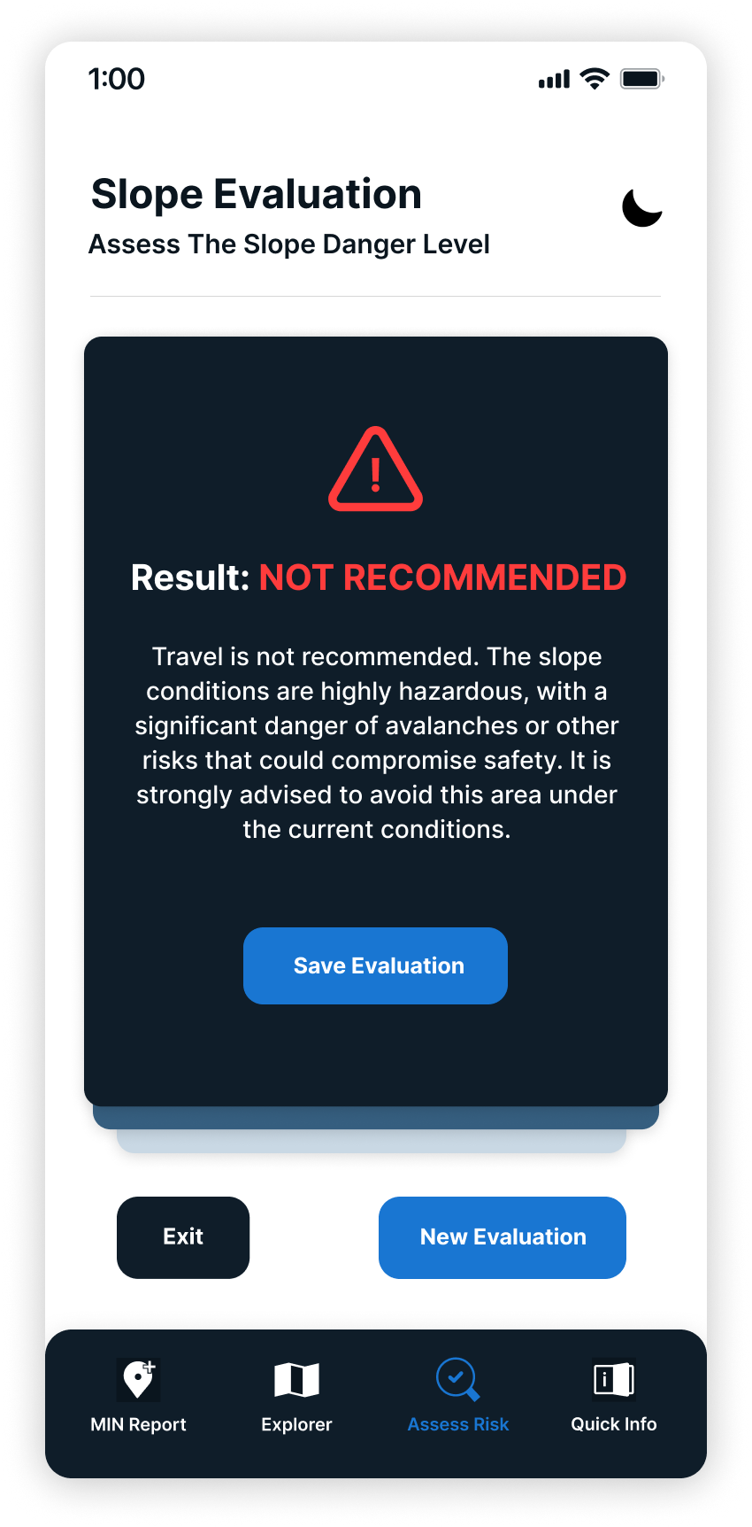
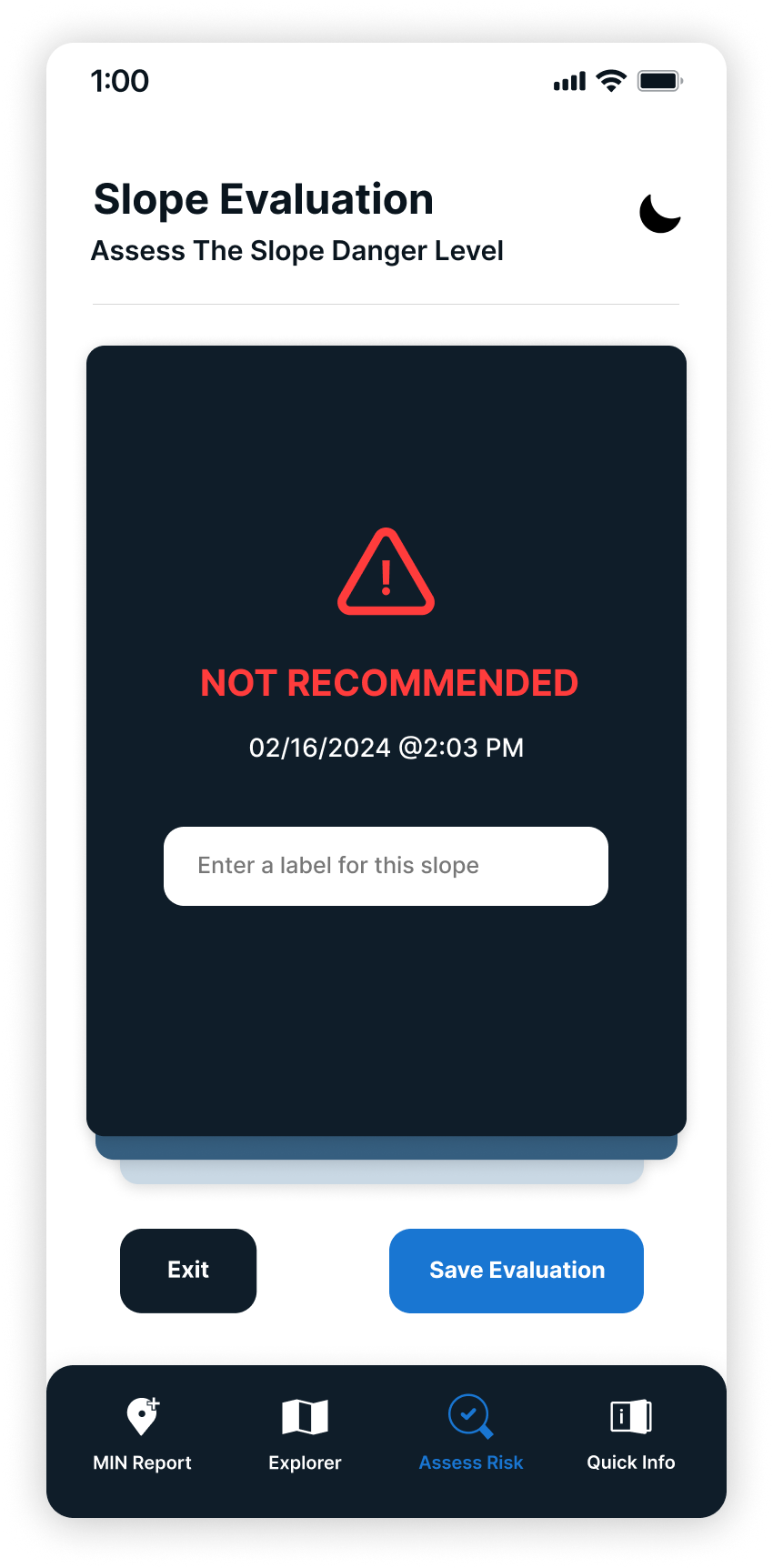
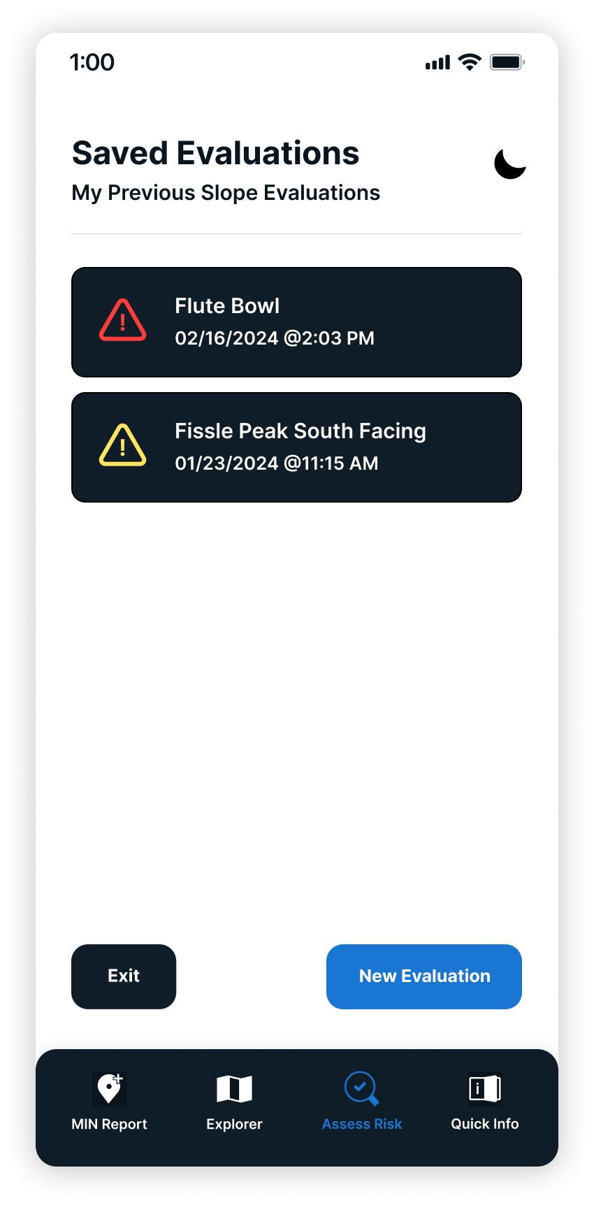
Slope Evalution Tool Process
Light mode vs. Night mode
The redesigned app makes it easier for backcountry ski and snowboarders to find and understand the most important avalanche safety information. Users can quickly check things like risk zones, weather updates, safety checklists, and what to do in an emergency, all in one place, and even if they don’t have cell service. By organizing everything clearly and cutting out extra steps, the app helps less experienced users feel more prepared and make safer choices in the backcountry.
Citations
Cbc News. (2023, March 2). Why is B.C.'s backcountry so susceptible to avalanches this year? CBC. https://www.cbc.ca/news/canada/british-columbia/dangerous-avalanche-conditions-bc-explained-1.6725713
Vanessa Zwierzchowski
All rights reserved © 2025