Mission Hill Winery, Interaction + Product Design
Timeline 3 weeks
The team 3 students
Role Visual Design, Product Concept, Interaction Design
Tools Figma, FigJam, Adobe Photoshop, User Interviews, User Workshops
As visual design and product concept lead, my team and I developed a campaign that responds to how traditional wine culture can feel exclusive, overly formal, and hard to connect with, especially for younger buyers. Through interaction and visual design, the campaign reframes wine as something more approachable and community-driven, turning it into an experience meant to be shared with inviting curiosity and connection.
Initial Interviews
With Mission Hill Winery as our client, I started by digging into why wine can feel intimidating. I facilitated interviews with people in our target demographic (ages 20–25) to better understand how they choose wine. It quickly became clear how overwhelming the experience can be. One participant summed it up perfectly: “Choosing wine feels overwhelming, so many types, regions, and vintages. It’s hard to know where to begin as a newbie.”
This feeling was echoed throughout our research, revealing three key insights:
1) Newcomers rely heavily on simple, easy-to-digest guides to navigate the wine world. 2) The uniform design of wine labels in stores makes it hard to tell one brand from another. 3) And no single brand currently stands out or leaves a lasting impression on first-time buyers.
Curated Workshop
To dig deeper into these points, I led a collaborative UX research workshop using FigJam. Alongside the same participants and two Mission Hill staff members, I facilitated a series of interactive, visual-based exercises focused on brand perception and emotional connections to wine. The open, low-pressure environment encouraged honest feedback and revealed themes that hadn’t surfaced during interviews alone.
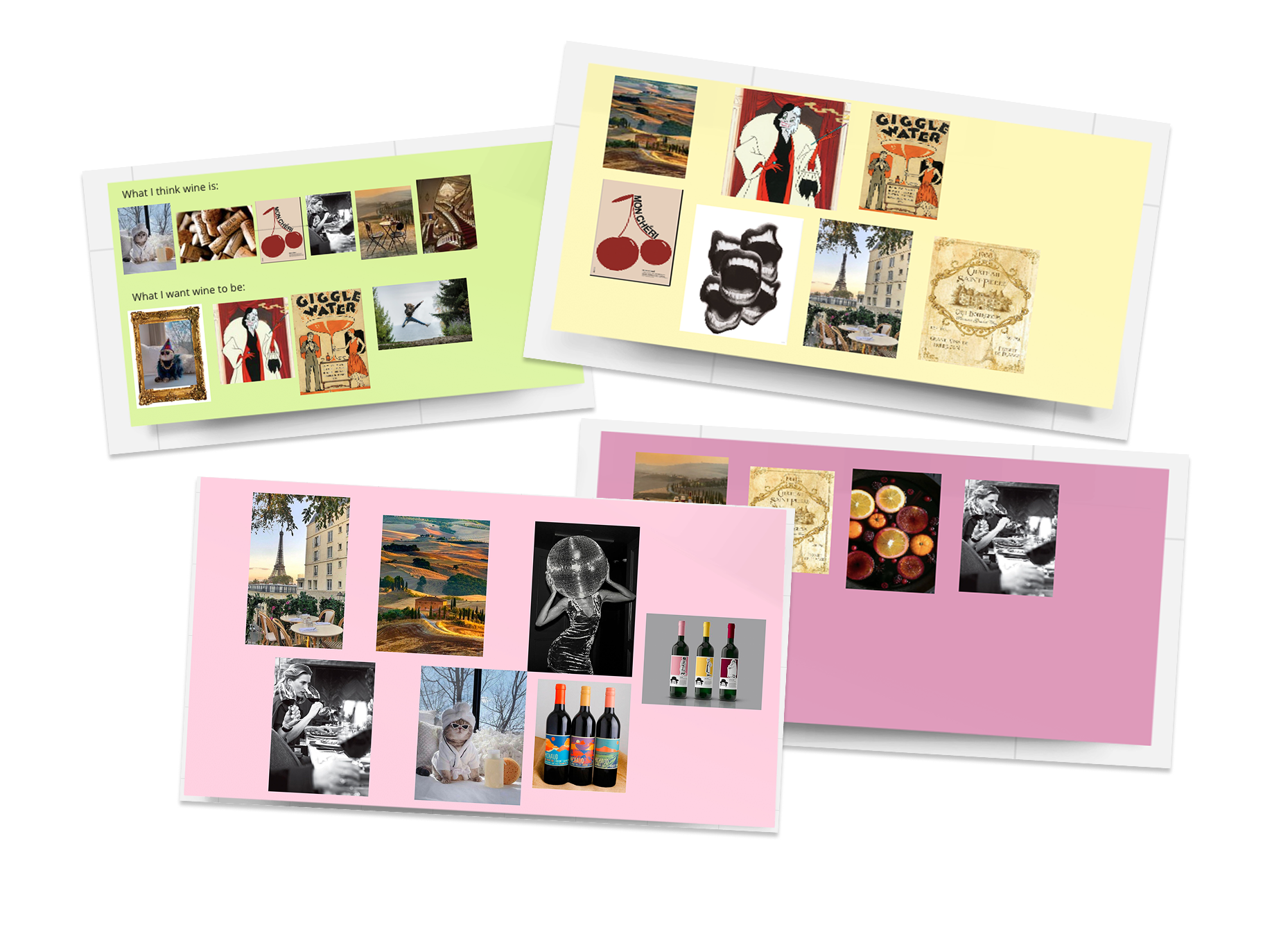
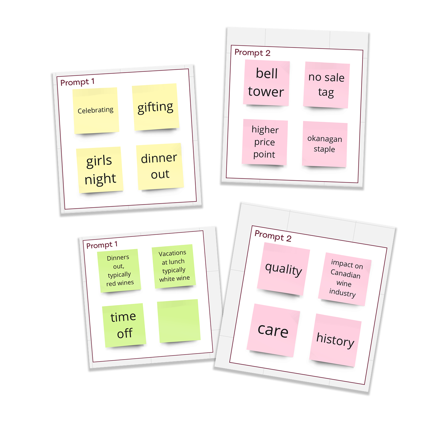
One key activity, the “Visual Toolkit” (seen above), asked participants to build mood boards using curated images. Most selected scenes of dinner parties and shared meals, reinforcing that wine, especially for younger consumers, is more about connection than formality. I also ran a brand association exercise, which uncovered a clear disconnect between how Mission Hill employees and younger buyers perceive the brand. While staff resonated with its rich history and upscale image, younger participants were drawn to something more inclusive, social, and fun. These insights directly informed our campaign direction and helped us reposition the brand to feel more approachable and relevant.
Concept Development + Process
My initial concept aimed to make wine feel more interactive and collectible by introducing puzzle-piece packaging tied to a customer reward system. While the idea was fun in theory, it fell flat during developmental tests due to material constraints and a lack of meaningful engagement (it didn’t deliver the level of interaction I was hoping for), and peers didn’t find it compelling enough to keep or collect. This pain point pushed me to rethink how I may incorporate a sense of interactions that would bring curiosity among users.
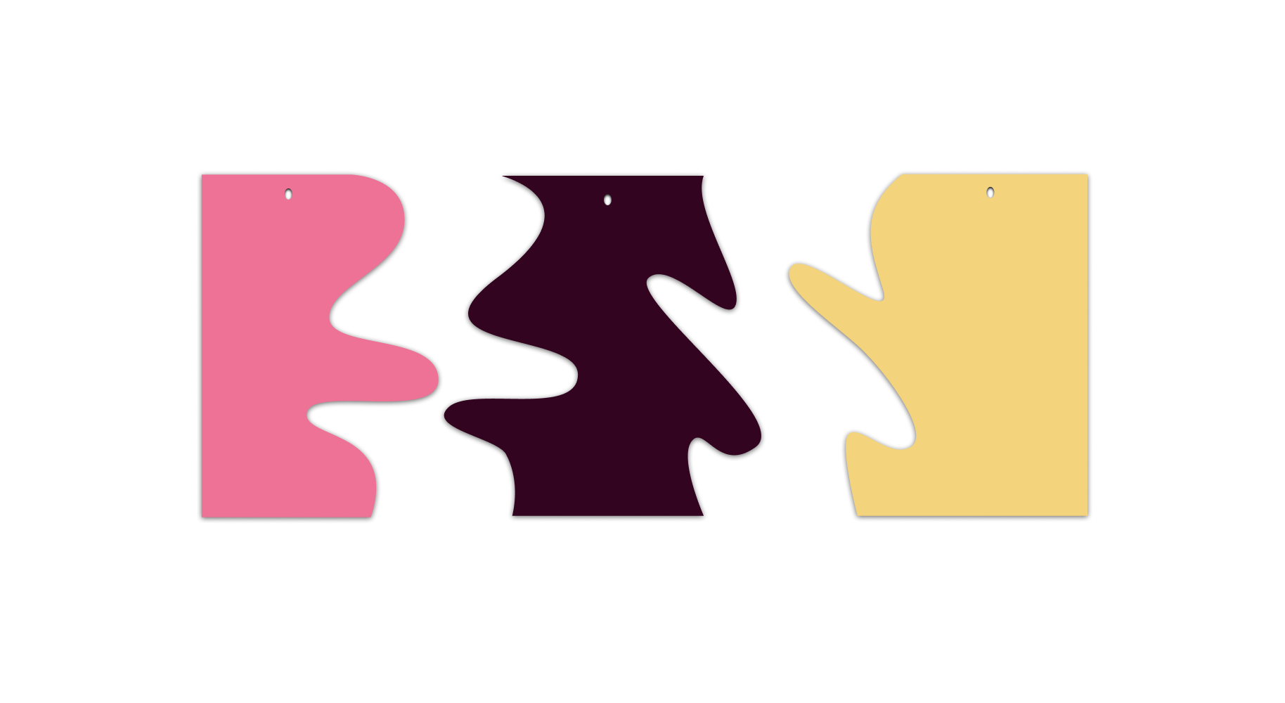
Still, the intention to create a fun and inviting experience stayed central to my approach. This led to developing a playful colour palette inspired by red, white, and rosé wines, the famous trio. These tones became a key part of the brand’s visual language, reinforcing approachability and helping the campaign feel more relaxed and engaging for a younger audience.
Second Phase of Concept Development
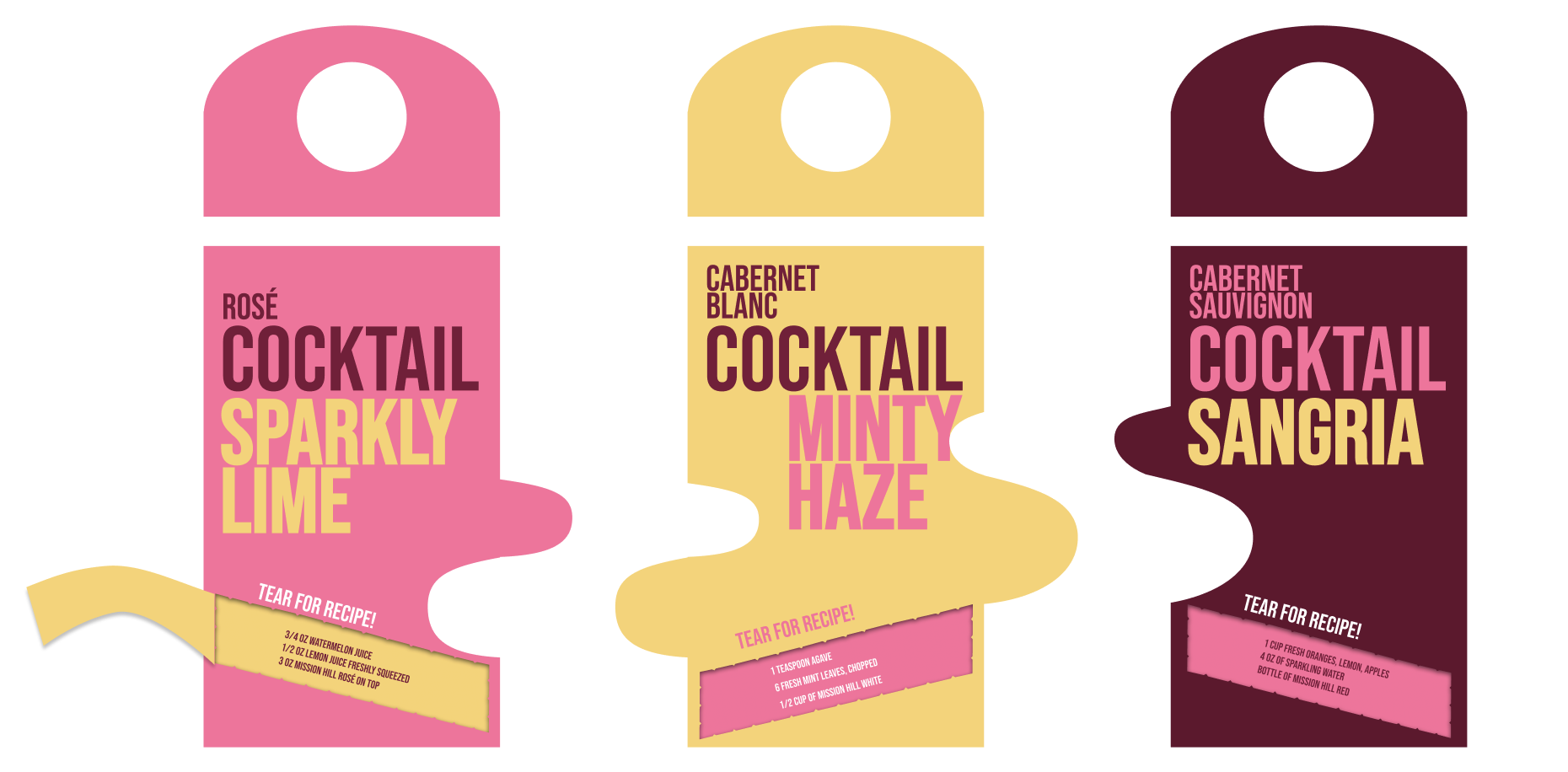
During a design sprint, I incorporated cocktail recipes into the labeling to cater to Gen Z’s developing palate and make wine feel more accessible. I initally tried to carry the "puzzle" idea seen into this phase, but usability concerns and material constraints surfaced again during prototyping, prompting a pivot toward a more feasible and user-friendly solution.
Final Phase
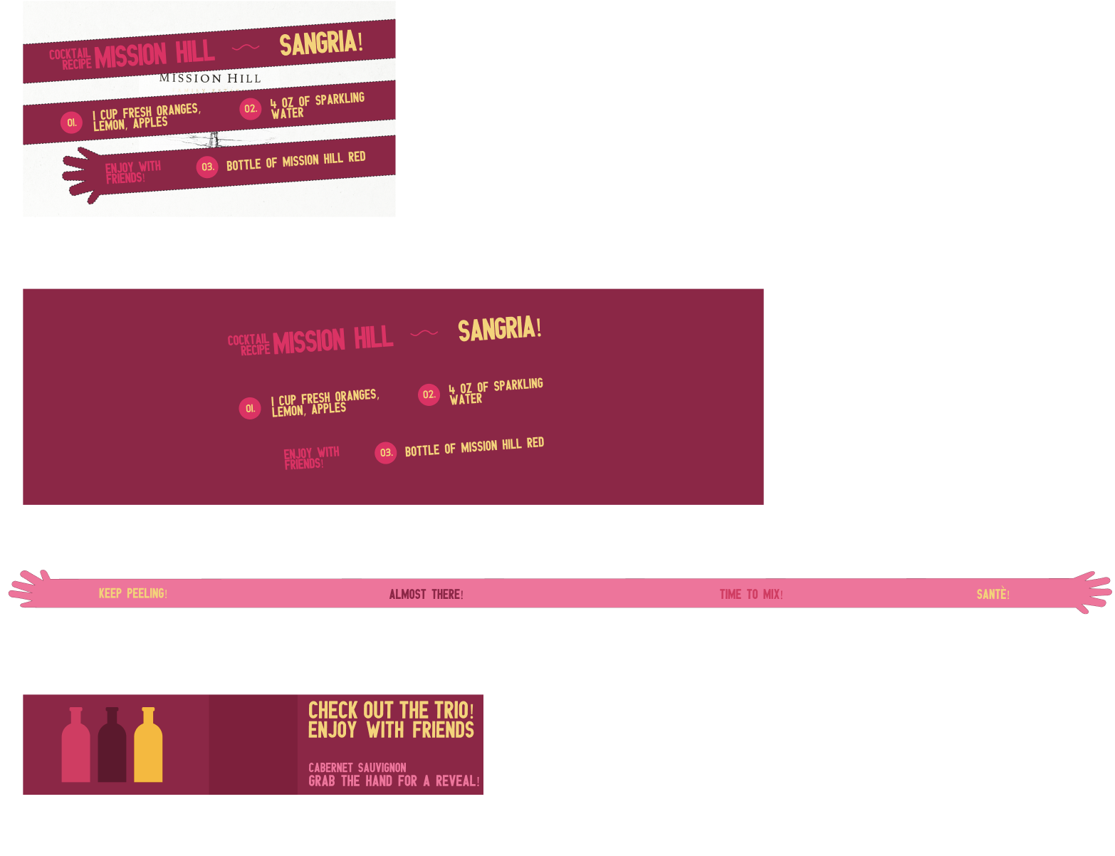
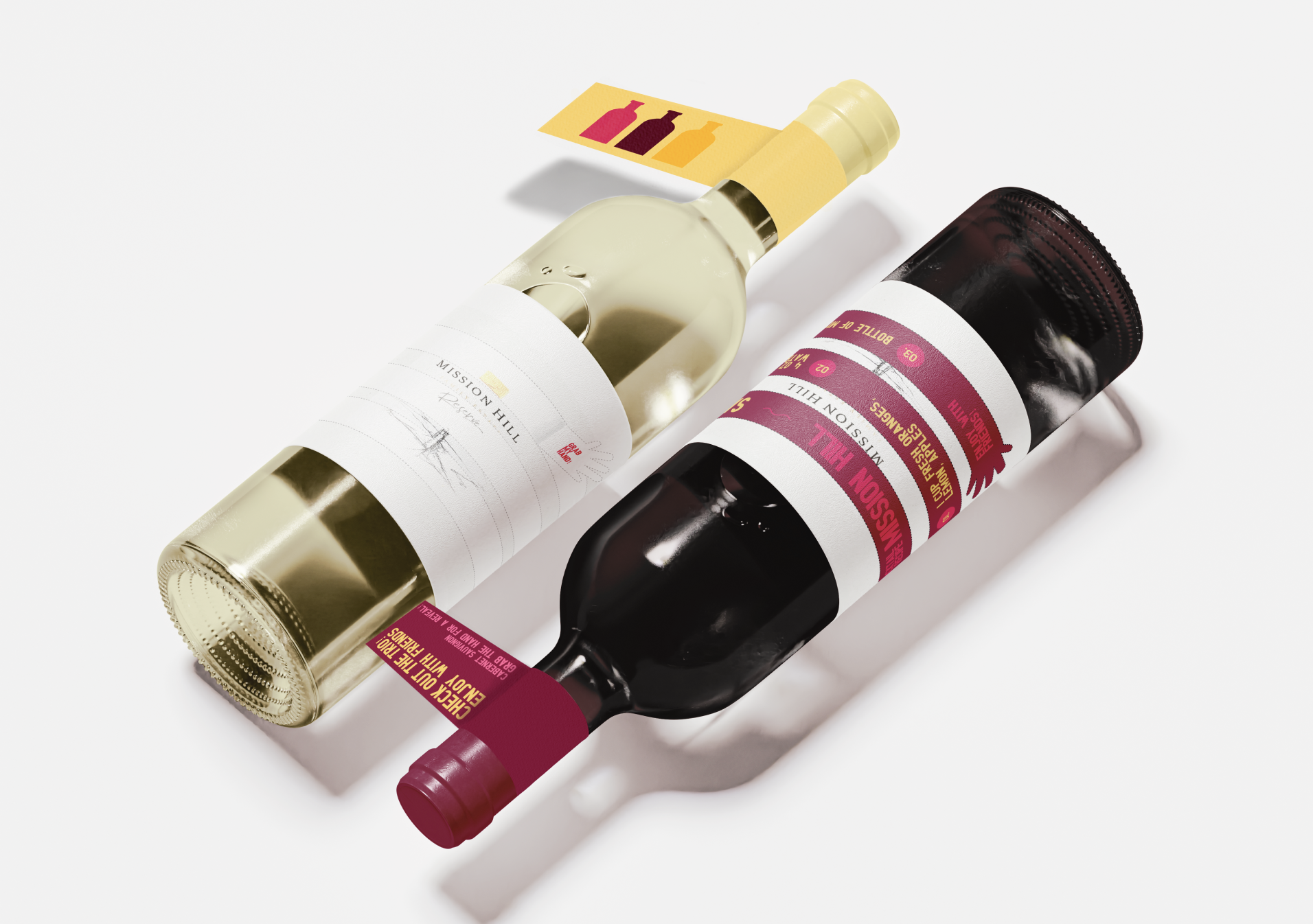
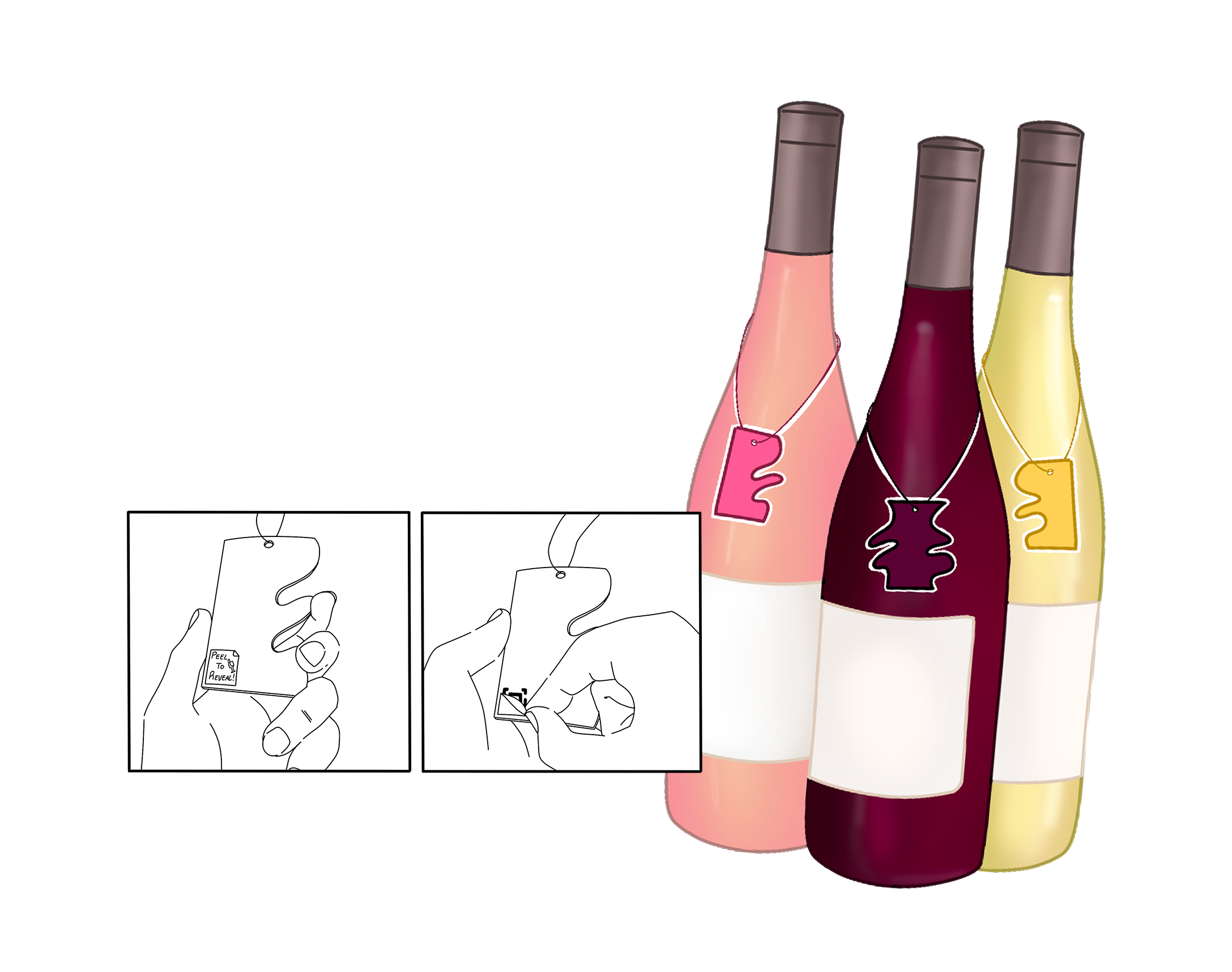
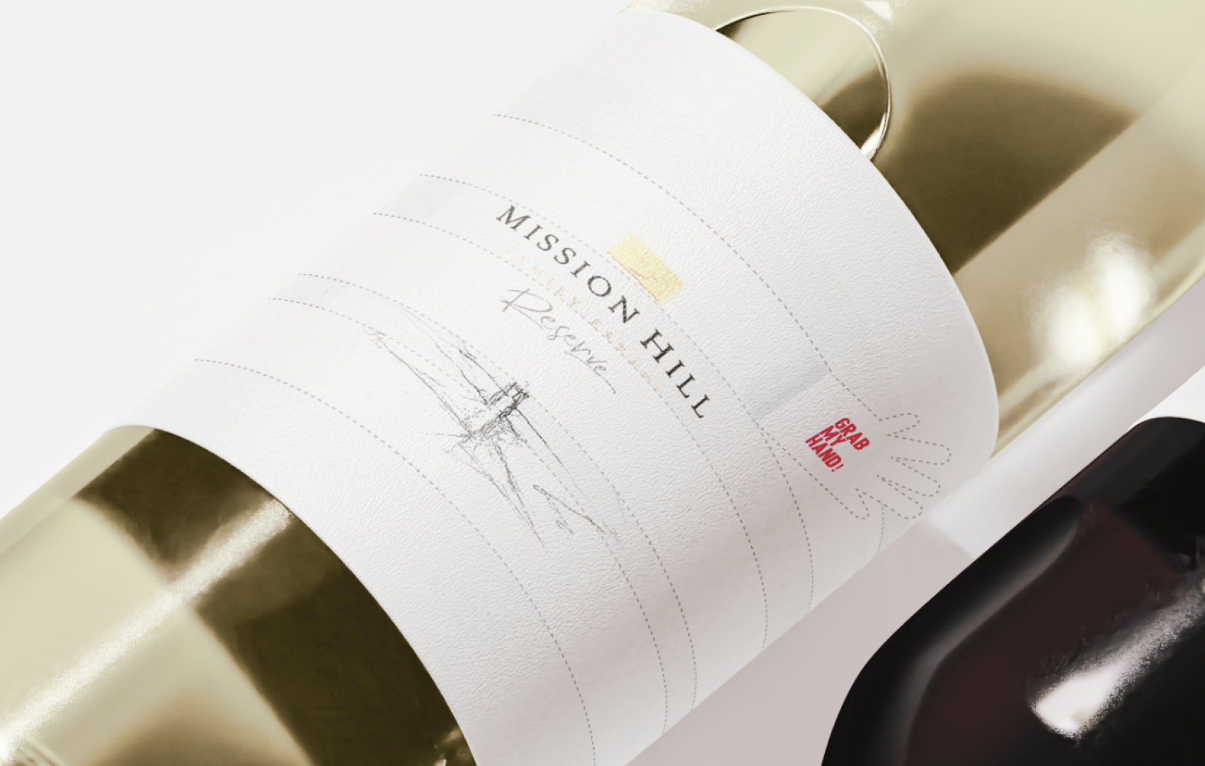
I had the idea of prolonging the experience by incorporating a cocktail recipe as an interactive, perforated tag that wraps fully around the bottle. This process involved carefully planning the layout and alignment within the label’s dieline to ensure the tear-off section was both clear and functional (and adding a little hand icon for a playful touch). Though the concept was prototyped digitally (final layout plan seen on the left), I considered how its placement and perforation could create a tactile, engaging interaction that encourages users to pick up and explore the product.
From a UX perspective, the design was guided by Nielsen’s heuristics, specifically “match between system and the real world” and “user control and freedom" (Nielsen & Molich, 1990). The tag mimics a real, familiar action (tearing off a coupon or note), which helps users instantly understand its purpose.
At the same time, it gives them the freedom to interact with the product on their own terms, turning what’s usually a passive experience into a moment of discovery and ideally a fun moment with friends.
The Outcome
Citations
Nielsen, J., & Molich, R. (1990). Heuristic evaluation of user interfaces, Proc. ACM CHI'90 Conf. (Seattle, WA, 1-5 April), 249-256.
Vanessa Zwierzchowski
All rights reserved © 2025