La Bâtie, Visual Design
Timeline 2 days
Role Visual Design, Content Curation
Tools Figma, Adobe Photoshop
La Bâtie is a multidisciplinary performing arts festival based in the Grand Genève area, known for its bold programming and rich mix of international and local talent. Tasked with creating posters and graphical assets for the festival, I developed two distinct visual directions that reflect the spirit of La Bâtie through contrasting design approaches (functional vs. expressive).
Line 1 (Functional) Content Curation
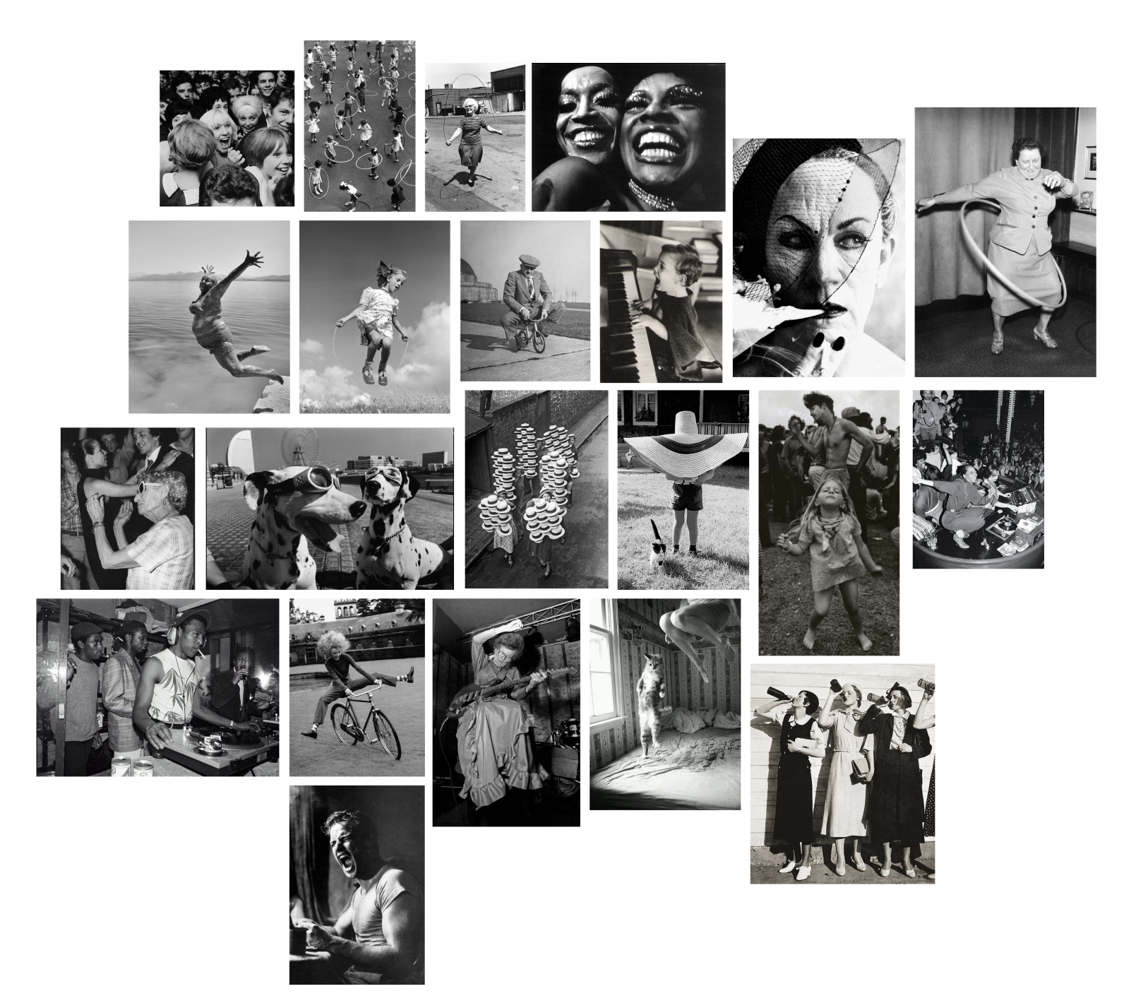
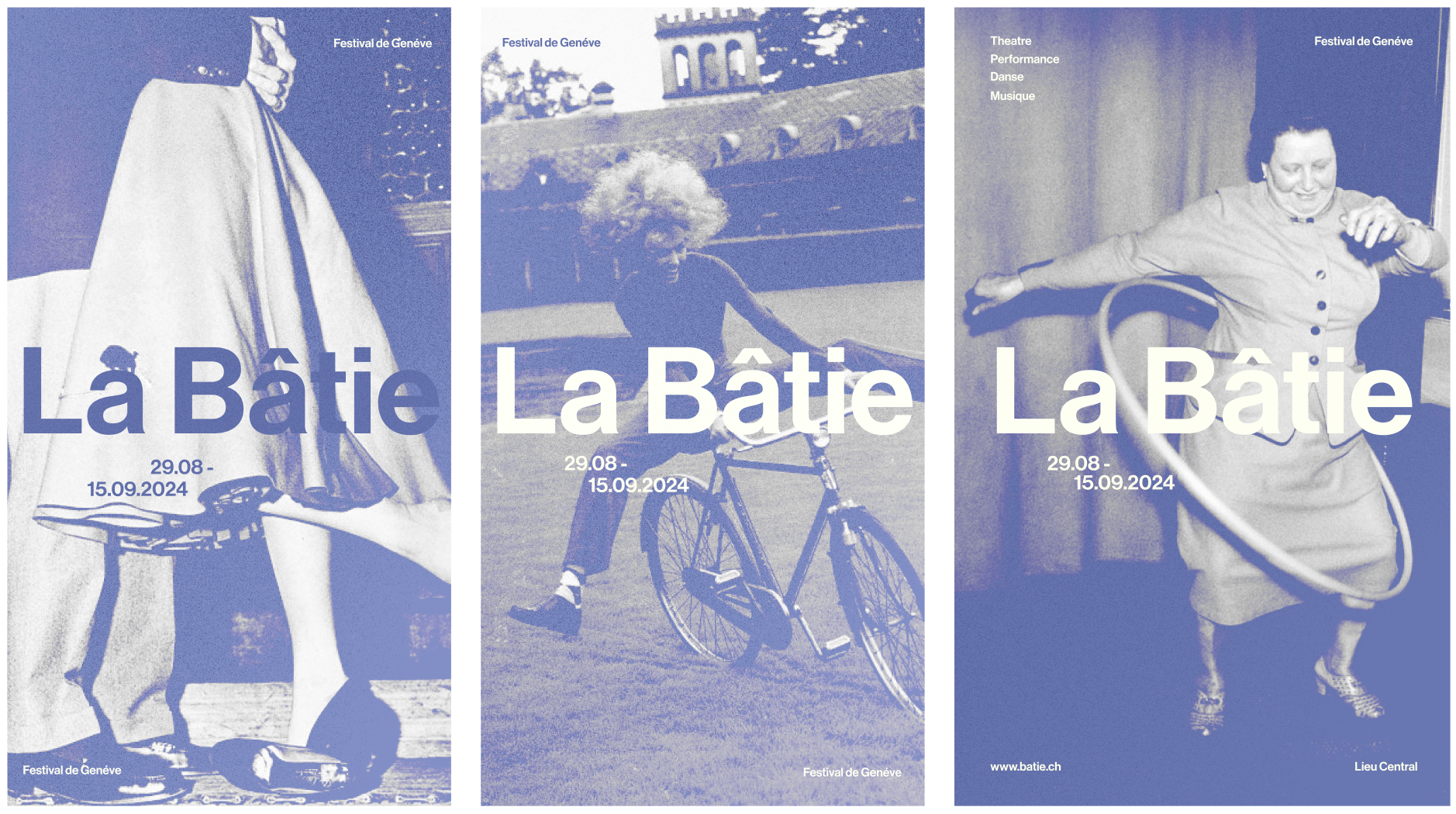
This direction draws from La Bâtie’s deep-rooted legacy in live performance. I was inspired by archival b&w film photography from the 1960s to 1980s, photographs that captured either an intense emotion or movement. To me, these images evoke the history of creatives, and overall atmosphere that aligns with the intimacy of the festival’s performances.
Sourcing this imagery became an essential part of the process, looking for real sense of character was important to me as I wanted imagery to be the star of the graphical assets.
Line 1 Monochromatic Colour Exploration
The imagery set the tone for this poster series, but I wanted to make sure the layout felt just as intentional. I created a grid system with the posters, playing with asymmetry to create movement and rhythm on the page, drawing inspiration from Ellen Lupton’s design principles around contrast and spacing.
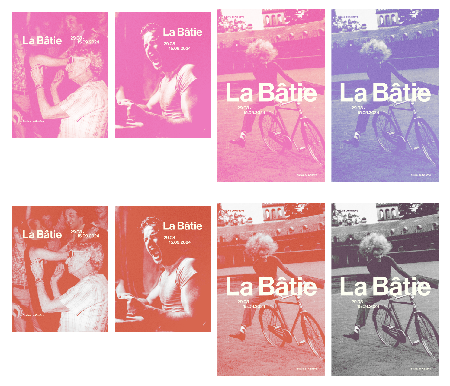
The high-contrast photos already had a lot of character, so going monochrome to add in colour helped tie everything together. The monochromatic blue almost gave the final poster a stamped, archival look, which I decide to run with.
Line 1 Final Poster
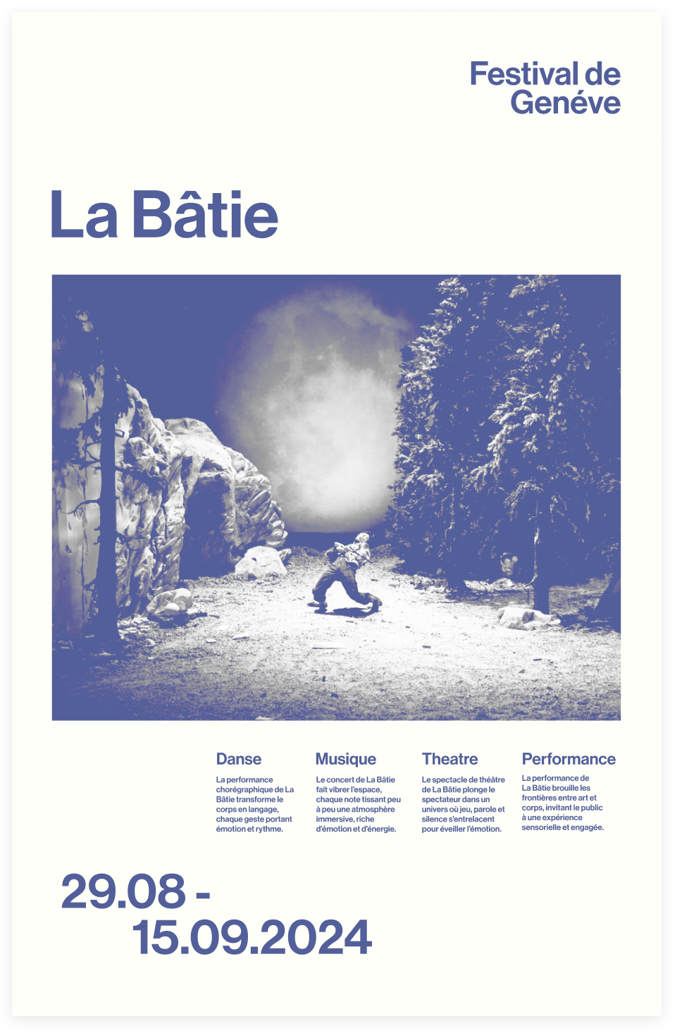
The final submitted poster embraced a periwinkle monochromatic style. I chose a clean sans-serif typeface with subtle shifts in weight to maintain clarity while adding visual interest. The imagery takes center, while the typography brought in just enough structure to make the design feel contemporary with a clear grid. I used white space to create a sense of balance as well, helping to frame the content and the artist featured.
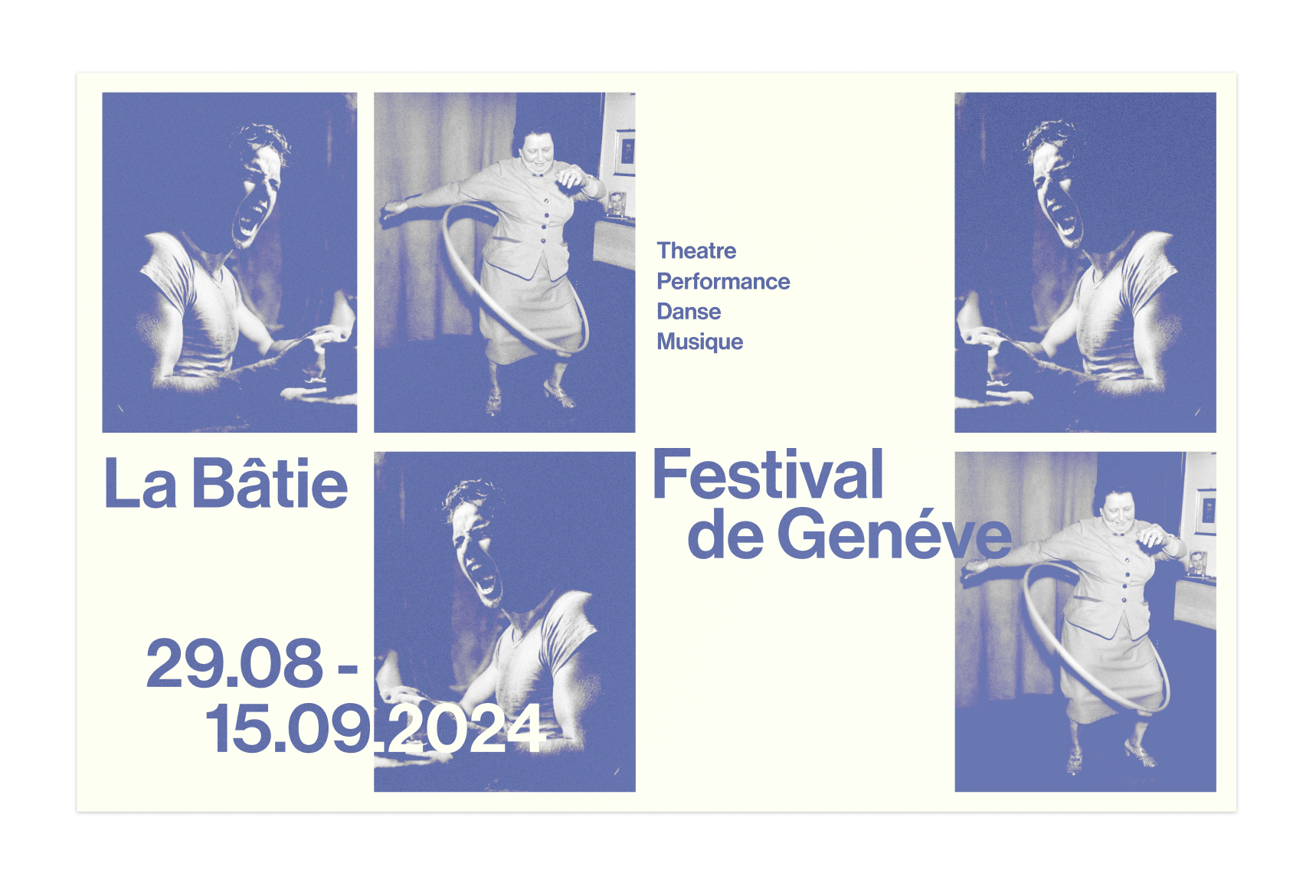
Line 1 Graphical Assets
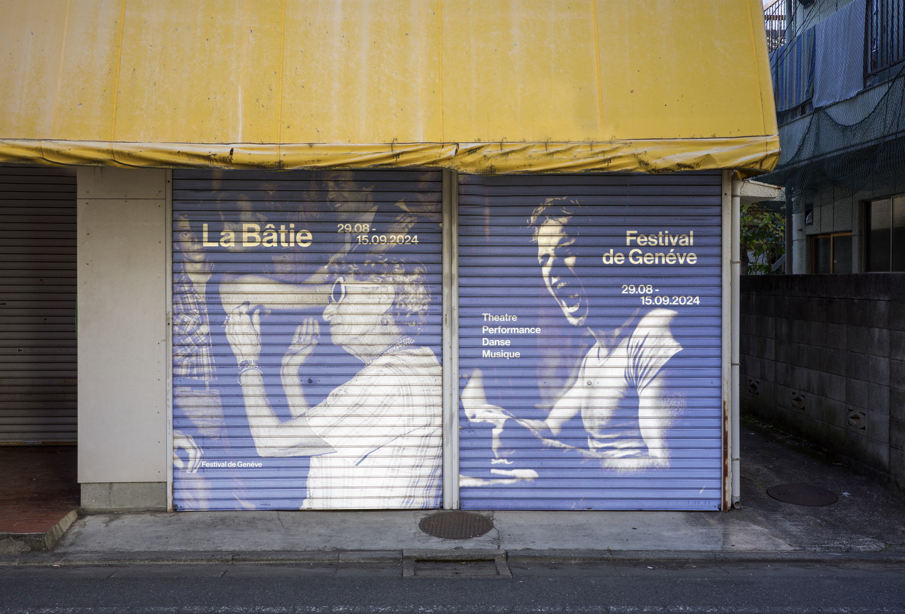
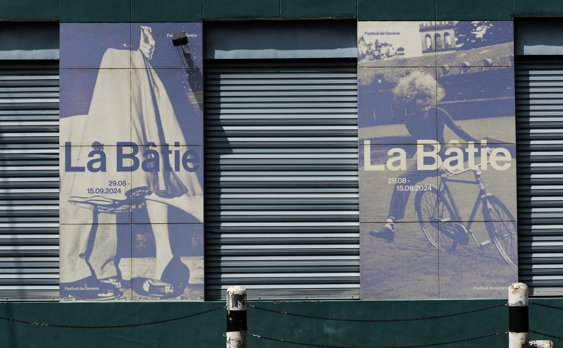
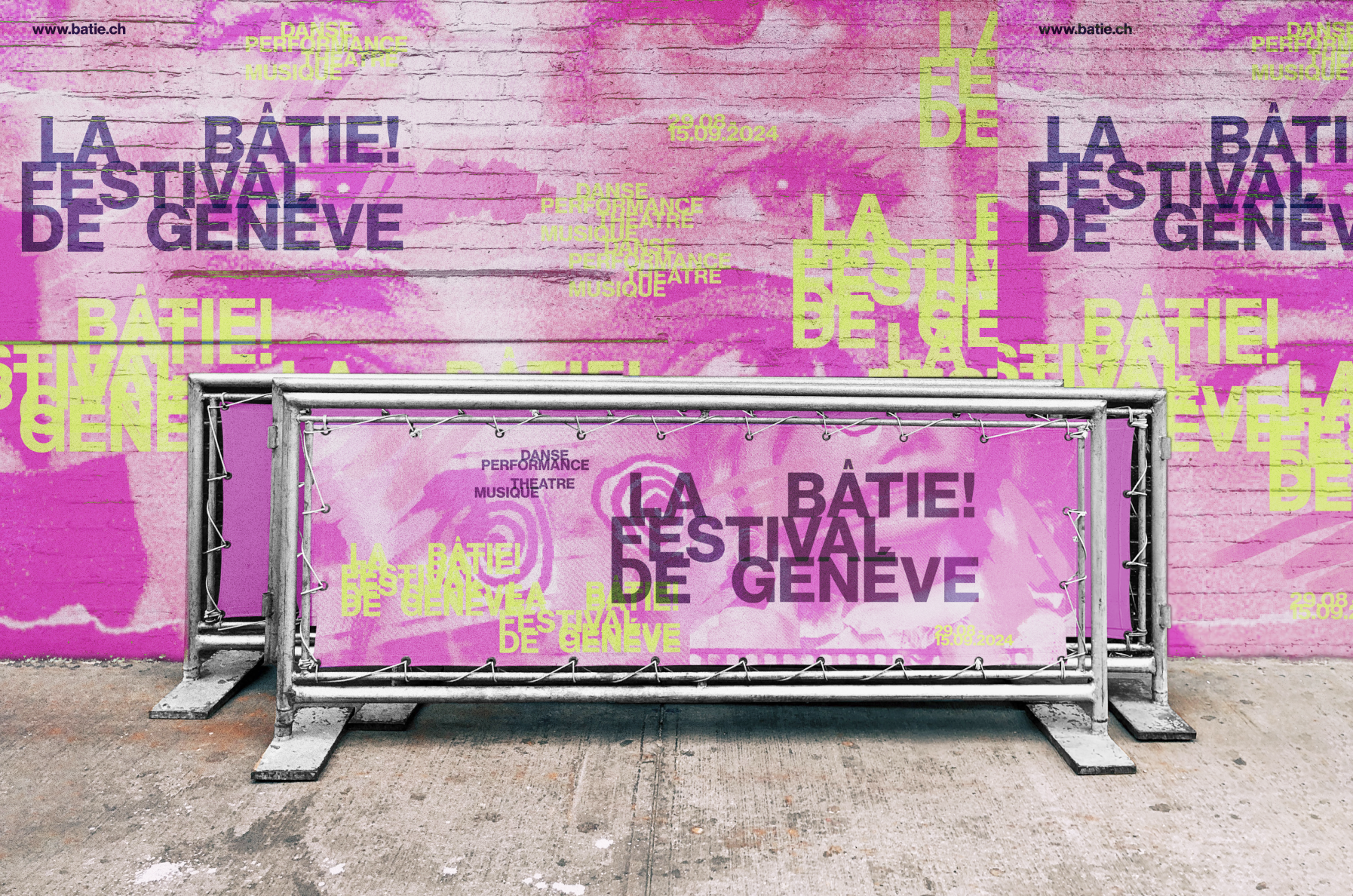
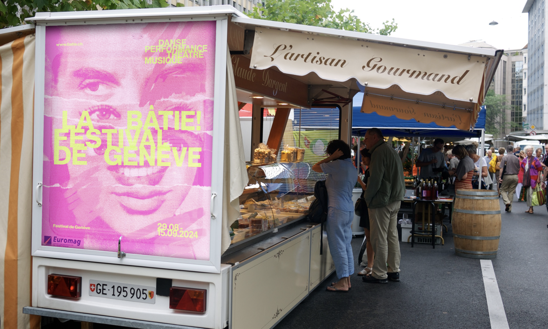
Another enjoyable challenge in this brief was creating graphical assets based on the final poster. The project had a straightforward path, using the finalized poster as a foundation for developing variations that maintained a consistent identity. For the public-facing assets, I wanted them to blend naturally into their surroundings, so I chose everyday surfaces like metal shutters and building panels to introduce the design into the city in a subtle, integrated way.
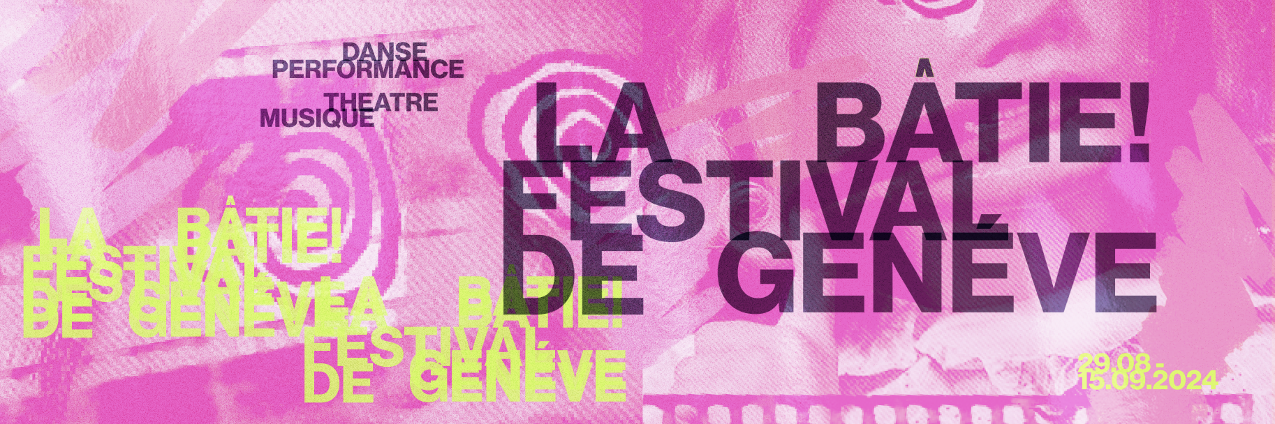
Line 2 (EXPRESSIVE!)
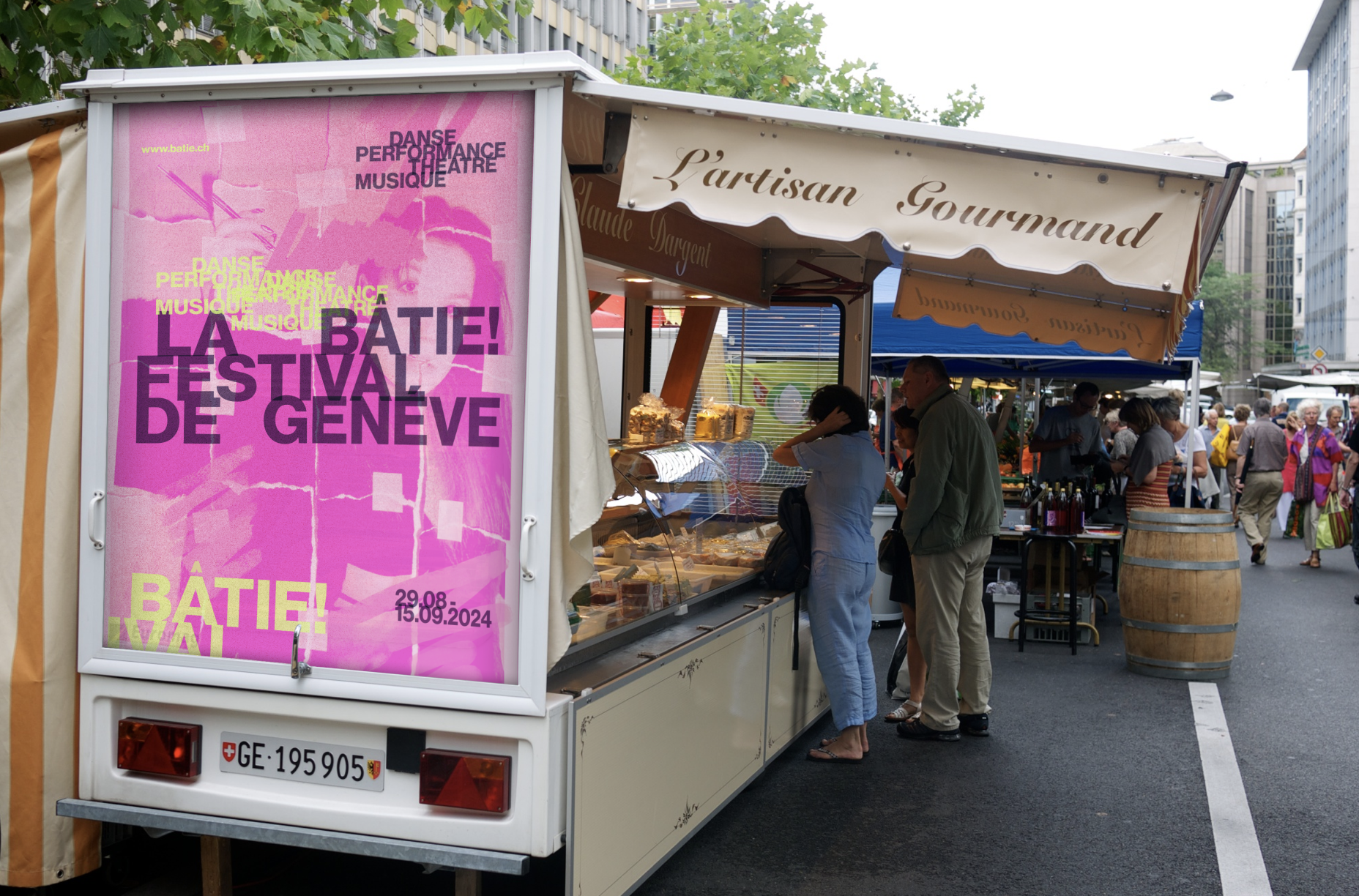
This direction was deliberately messy. I blended analog and digital elements, scanned textures, torn paper, brush strokes, film, photography, and transparent overlays. I was less concerned with order or organization and more focused on contrast and loud elements. Even though the layout appears chaotic, I used Ellen Lupton’s ideas on layering, transparency, and visual hierarchy to maintain clarity.
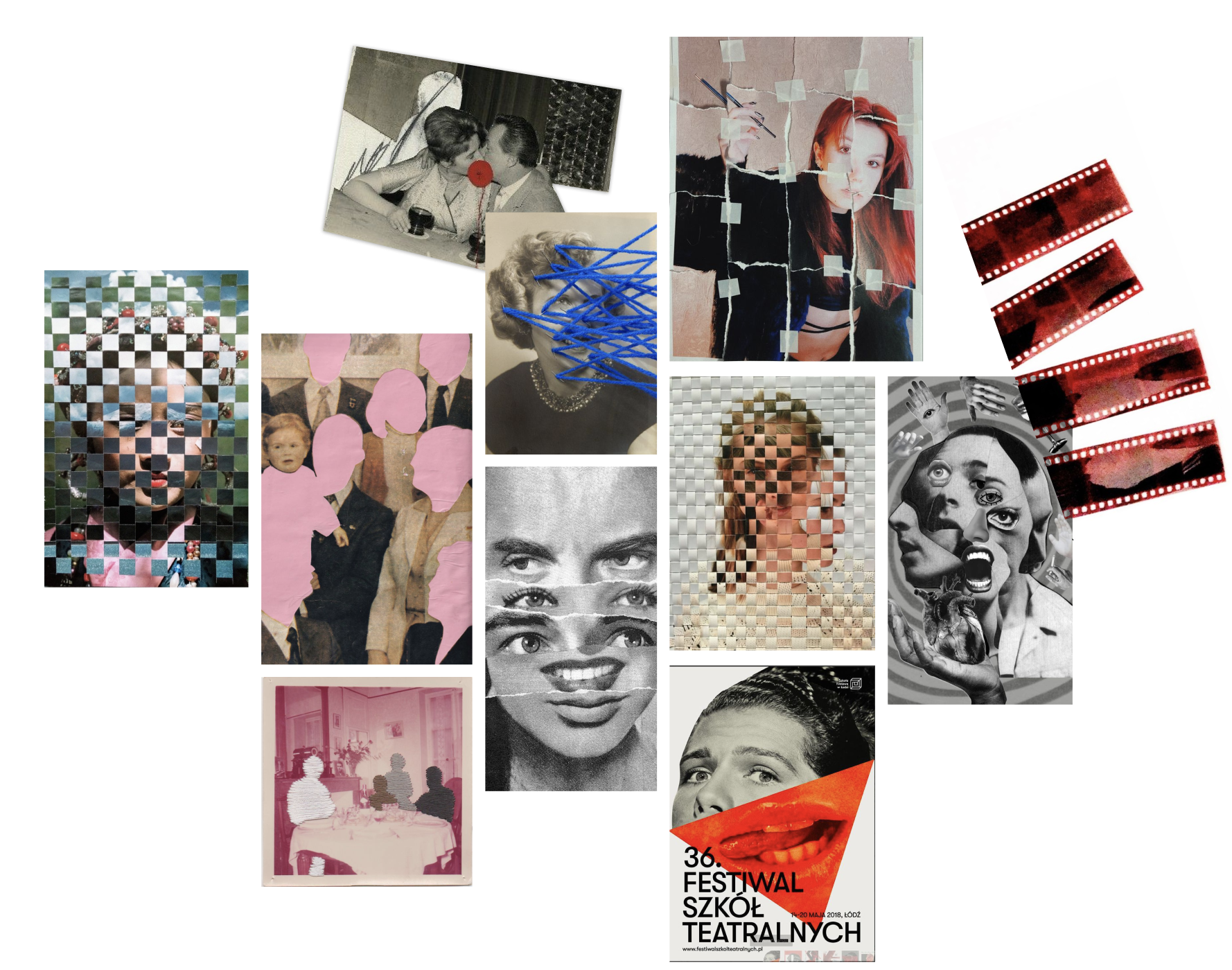
With limited time, moodboards helped to guide my direction regarding characteristics I knew I wanted to include (as mentioned: layering, transparency, etc.). Various textures, colours, and mediums are throughout these images, allowing me to shape the visual language for this direction. This process allowed me to stay focused while still experimenting within poster compositions.
Line 2 Layering
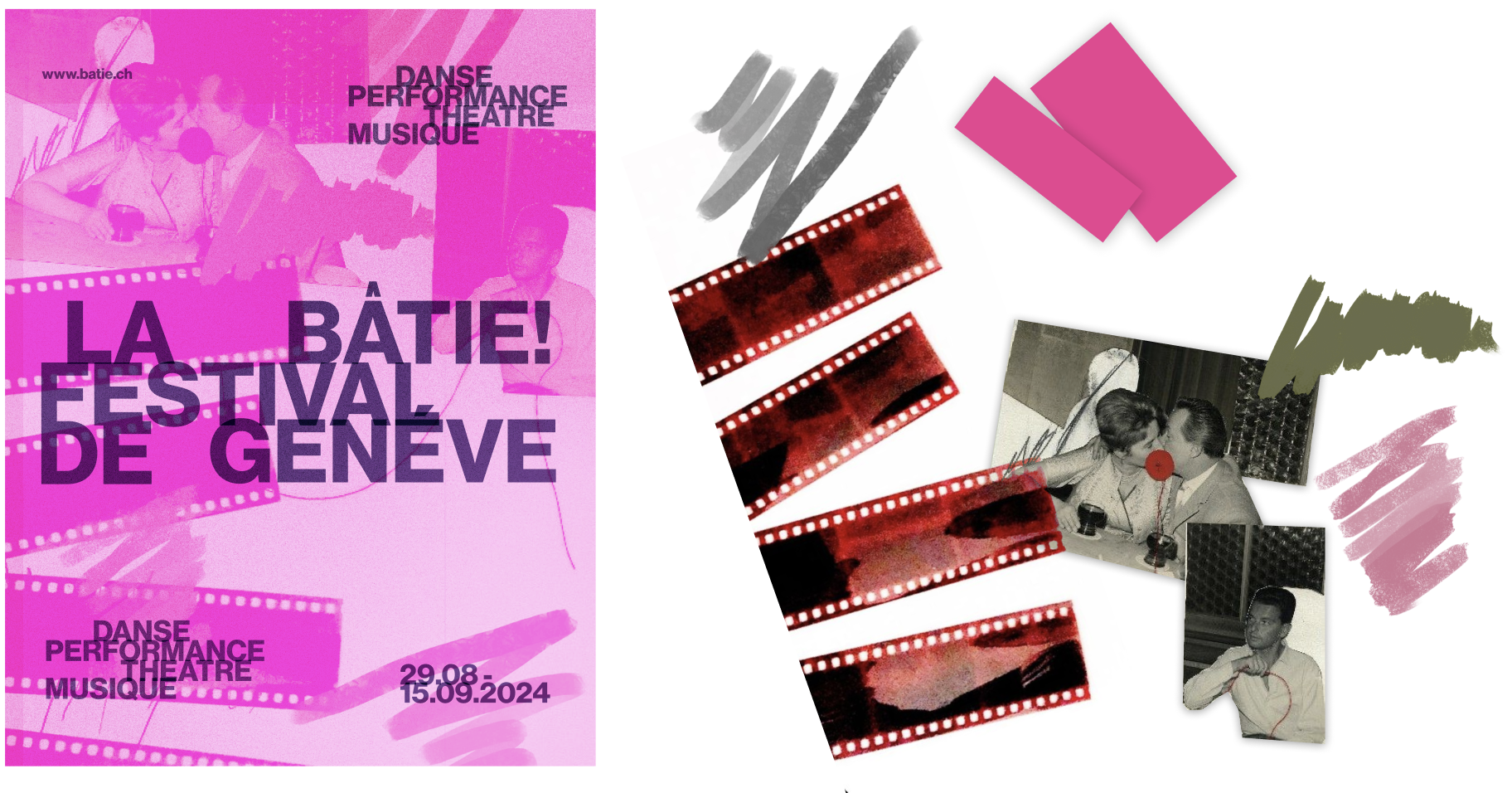
In my initial poster using this direction, I began finalizing a visual language by experimenting with sourced elements that felt tactile and expressive. These included film rolls, candid images of people, pen markings, and shapes. By layering these components, (sometimes overlapping, sometimes placed side by side) I was able to create a sense of depth and texture within the background. This approach not only gave the composition a collage-like quality, which I wanted, but also allowed each element to interact with each other.
Line 2 Inital Posters
Line 2 Final Poster
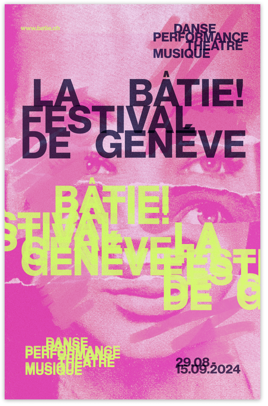
The final submitted poster for line 2 also used a monochromatic pink base to seamlessly blend the collage elements in the background. A sans-serif typeface was chosen to keep the layout contemporary, with layered, transparent, and neon type treatments adding dimension. In constrat to line 1, the imagery here is spread throughout the page, creating a strong/loud presence of texture and visual layering.
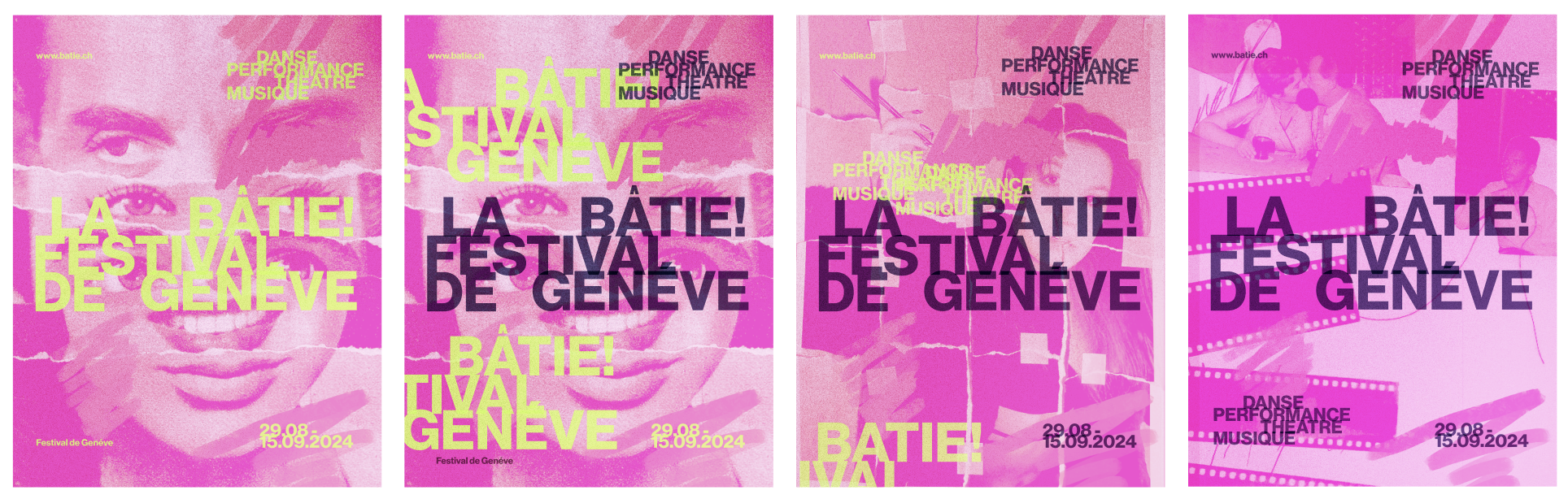
Line 2 Graphical Assets
Vanessa Zwierzchowski
All rights reserved © 2025